


Over the next twelve months, I'll be exploring the Xamarin mobile development platform here in CODE Magazine. The main focus of the series is the new Xamarin.Forms segment of the Xamarin SDK. You probably already know the niche that Xamarin fills in the mobile development space. If not, here's the thirtysecond elevator pitch.
Xamarin is a popular cross-platform toolkit aimed directly at the .NET developer. It provides a way to write project code in C# and produce an app that runs on Android, iOS, and Windows devices. Xamarin.Forms, the newest addition to Xamarin, is a powerful toolkit that provides a single, XAML-based way to define a UI that works across all those devices. Plus, it provides a set of UI controls that are simple to use within your XAML. When the app is compiled to native code, the Xamarin.Forms controls are turned into the native UI elements necessary for each mobile platform.
In the March/April 2015 issue of CODE Magazine, I took a high-level look at Xamarin forms. In this article, I want to dig into the guts of the Xamarin.Forms system and pull out the details of the object model.
Top of the Object Model
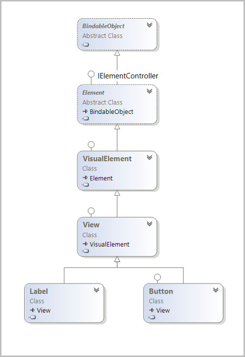
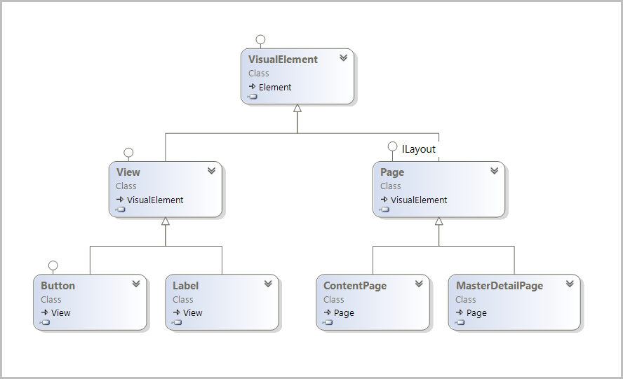
The types I'm exploring live in the Xamarin.Forms.Core.dll (version 1.4). There are approximately 170 types in this assembly, most of them optimized for producing user interfaces for mobile devices. The core libraries for Xamarin.Forms live in two namespaces. Xamarin.Forms.Core and Xamarin.Forms.Xaml. The Xamarin.Forms.Xaml namespace is small, containing a few interfaces and types that enable XAML support for rest of the class library. For this article, I'll focus on the significant types in the Xamarin.Forms.Core namespace and I'll start by looking at the class hierarchy for the Button and Label classes shown in Figure 1.
There are approximately 170 types in the
Xamarin.Forms.Core.dll(version 1.4) assembly, most of them optimized for producing user interfaces for mobile devices.
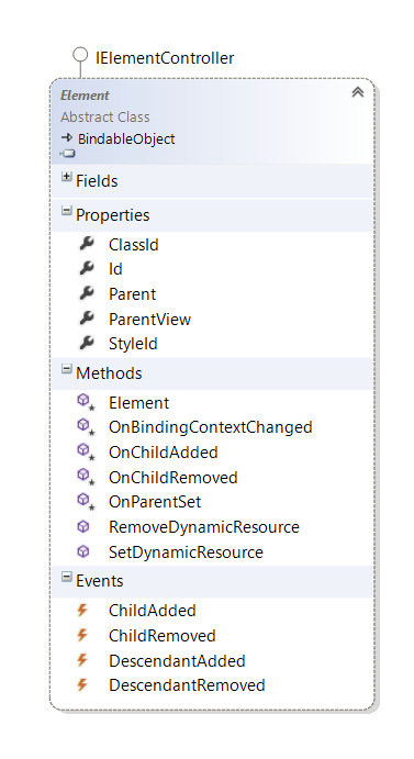
The journey starts at the root object in Xamarin Forms, the BindableObject class (see Figure 2). All classes in the Xamarin.Forms ecosystem derive from BindableObject, which provides access to the binding services available in the framework.
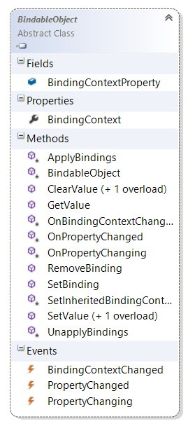
Binding is such an important concept for the framework that Xamarin includes its core features in the base class itself. This means that any Xamarin.Forms class can tap into the binding system and use its services to shuttle data between itself and other types. And it also indicates that a public property on a Xamarin.Forms class is almost certainly a bindable property.
Before looking further in the class hierarchy, let's explore some principles of data-binding.
Detour to Discuss Data-Binding
Binding frameworks have been around for a long time. They are prevalent in most UI development systems; for instance, .NET has certainly had some interesting implementations in the past.
Let's start by taking a high-level view of an imaginary binding framework for objects (see Figure 3).
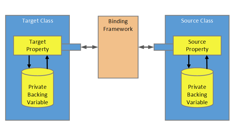
Binding systems typically have three participants. There's a source class that contains the underlying data for the binding and a target class that consumes that data. And then there's the third member, the binding engine itself.
The target and source classes both expose public properties that are visible to the binding framework. Each class stores its property data in a private field. Since the binding framework can't access the private data, it works with the public properties; it reads the value from the source property and applies it to the target property. Transferring data in this fashion is a trivial operation; it hardly seems necessary to employ a binding framework to do this work. Any competent developer could do it themselves. That means that binding frameworks must provide other services to earn their keep. For example, most frameworks provide formatting features, validation services, and automatic synching of data between the data partners.
So what about data synching? How does a binding framework know when to update the source and when to target? The answer is obvious: Each class in the binding pair needs to notify the binding framework when their bound property changes. In general, the framework expects the target and source to implement certain constructs in order to participate. This can be accomplished by requiring a class to contain a recognized interface, by demanding that it raise designated events, or by other comparable techniques.
Xamarin.Forms uses concepts similar to the ones employed by other XAML frameworks. A data source class can implement the INotifyPropertyChanged interface and raise the PropertyChanged event when the property value changes. This is a common choice when creating a ViewModel or business class. Visual elements, like a Button class, are expected to use a different technique. The visual class must derive from BindableObject and it has to register any bindable properties with the Xamarin.Forms framework. Once the property is registered with the framework, the containing class is no longer responsible for managing the property state. Instead, the framework stores the data in a hidden receptacle where it can manage it and deal with value changes. Figure 4 shows an overview of how this might look.
Xamarin.Forms uses concepts similar to the ones employed by other XAML frameworks.
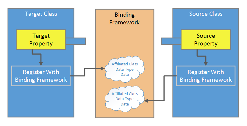
During the registering process, the class provides information to the binding framework. Some of the information is required, like the affiliated type, the underlying data type for the property, and the default property value. Other information, like the validation callback delegate, binding direction, and coercion delegates are optional. With this information, the framework understands which type instances are bindable and how to store the property data. One key point is that the target class also registers its properties with the system. That way, the binding engine knows which properties can serve as data targets. And it also indicates that the target properties can serve as source properties!
You might think from reading the last couple of paragraphs that the registration process is cumbersome. Not really; basic registration is just a few lines of code. The BindableProperty class (shown in Figure 5) provides the hooks for registering the property with the system.
To register, the class calls one of the .Create methods available on the BindableProperty class.
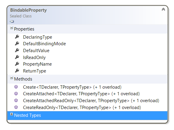
As you can see, there are four Create methods (Create, CreateAttached, CreateAttachedReadOnly, and CreateReadOnly). The following code example shows how to use the first one.
class BasicBindable : BindableObject {
    public static readonly BindableProperty WidthProperty;

    static BasicBindable(){
        //register the property with the
        // Xamarin framework
        WidthProperty = BindableProperty.Create
        <BasicBindable, double>(w => w.Width, 120.0);
    }
    // .NET property wrapper
    public double Width {
        get { return (double)GetValue(WidthProperty); }
        set { SetValue(WidthProperty, value); }
}
As a long-time WPF developer, I appreciate the Xamarin registration syntax. It's simple, clean, and readable. The first order of business is to create a public static read-only field with the property name. In the above example, it's named WidthProperty. Next, call the Create method. I've written that code in the static constructor in the snippet shown above, but it's very common to see this code placed on the same line as the field declaration, as shown in the following snippet.
public static readonly BindableProperty HeightProperty    =
BindableProperty.Create<BasicBindable, double> (w => w.Height, 120.0);
The generic arguments on the Create method represent the affiliated type (BasicBindable) and the underlying data type (double).
.Create<BasicBindable, double>
The method parameters indicate the Func for the property getter and the default value.
(getter: w => w.Width, defaultValue: 120.0);
One note of caution: The Xamarin documents suggest a slightly different Create syntax for production code. According to their developer guidance notes, the following code provides better performance.
// better performance in production code
WidthProperty   =   BindableProperty.Create
    ("BasicBindable", typeof(double),
                      typeof(BasicBindable), 120.0);
As a long-time WPF developer, I appreciate the Xamarin registration syntax. It's simple, clean, and readable.
Element Class
There's a lot more to discuss regarding binding, but that's enough for this article. It's time to move down the object tree and look at the Element class (see Figure 6). This class provides members, which grant access to the hierarchical tree of objects represented in the user interface. There are properties that give references to parent, child, and descendent elements. In case you are wondering, a descendent can be a child element, but it can also be further down the family tree (grandchild, etc.).
For example, there are events that fire when children/descendants are added or removed from the parent element. The Parent property is a read/write property for accessing the parent element. There's a similar named property (ParentView) that returns the closest parent element that is also a VisualElement.
Visuals
Further down the object tree is the VisualElement class (shown in Figure 7).
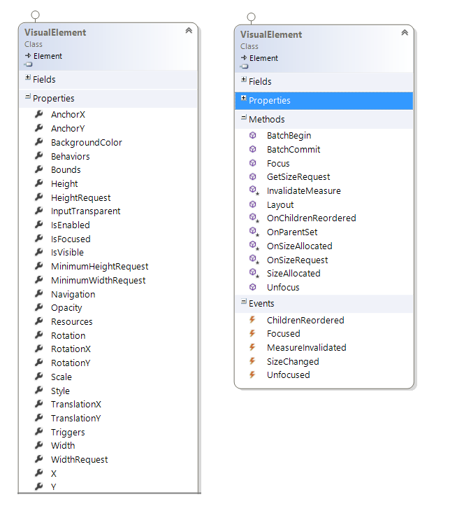
The VisualElement is the base class for on-screen elements. It accepts touch input and delivers the touch information to the derived classes. It's filled with properties, events, and methods that provide a useful starting point for creating items that are shown on a mobile screen. If you've worked with UI components in the past, you can probably deduce what most of the listed members do. The following code snippet shows using some of the VisualElement's members in C# code.
public VisualElementPage() {
    InitializeComponent();
    var button = new Button() as VisualElement;
    button.BackgroundColor = Color.Maroon;
    button.Scale = 1.4;
    // X and Y properties are read-only.
    // The Position is determined by the buttons
    // layout container
    var currentXPosition = button.X;
    button.Focused += Button_Focused;
}
private void Button_Focused(object sender, FocusEventArgs e) {
    e.VisualElement.BackgroundColor = Color.Lime;
}
These properties and events are available in XAML too.
<Label
    BackgroundColor="Blue"
    Opacity=".5"
    TranslationY="110"
    TranslationX="20"
    Focused="Button_Focused"/>
The View and Page Classes
We're finally down to the level of the classes used to build the mobile UI. What do you suppose is below the VisualElement class in the object tree? If your memory's sharp, you might recall looking at Figure 1 in this article. It shows that the View class is next on the tree. But I left out another important class that lives at this level, the Page class (shown in Figure 8). I'll briefly explore the purpose of each of these classes.
Xamarin Views are mostly a collection of input and output elements. In other frameworks, they're known as controls or widgets. There's also a type of View known as a Layout view, which I'll discuss later in this article.
Pages are comparable to screens. So you can think of it this way: Each screen in your app is one of the Page classes, like the ContentPage or the MasterDetailPage. The user can navigate between the screens, moving forward and back, from screen to screen, to complete their tasks. On each screen, there are one or more views; for example, I might add a Button, ProgressBar, Slider, Label and Picker to my ContentPage. Figure 9 shows the members of the View and Page classes.
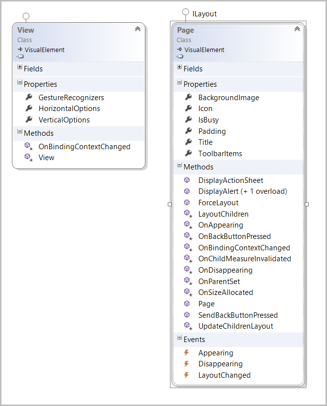
The View class adds one method and a few properties to the mix. It's here that you find the GestureRecognizers collection. Each View can have zero or more gestures assigned to it. At the current time, there's only one gesture in the Xamarin API: the Tap gesture. But the rumor mill says that Xamarin will eventually roll out gestures familiar to other UI frameworks (e.g., Swipe, Long press, Start, and End Touch).
This is where the HorizontalOptions and VerticalOptions properties appear in the object tree. These properties are used to position the View within its parent element. Here's an example in C#.
var button1 = new Button();
button1.Text ="Button 1";
var button2 = new Button();
button2.Text = "Button 2";

// center within the parent left and right edges
button1.HorizontalOptions =LayoutOptions.Center;

// Move to left edge of parent
button2.HorizontalOptions = LayoutOptions.Start;
// move to top edge of parent
button2.VerticalOptions = LayoutOptions.Start;
And similar example, with more settings, in XAML:
<Grid x:Name="MainGrid" VerticalOptions="FillAndExpand">
    <Grid.RowDefinitions>
        <RowDefinition Height="1*" />
        <RowDefinition Height="1*" />
    </Grid.RowDefinitions>
    <!-- Move to bottom edge of parent -->
    <Label VerticalOptions="End" />
    <!-- Move to right edge of parent in Left-To-Right cultures -->
    <Label HorizontalOptions="End" />
</Grid>
The Page Class
The Page class contains more type members than the View class. Here, you'll find properties for setting the page title, background image, page icon, and padding. You can set the IsBusy property to true, which causes the platform activity indicator to show the page as busy.
There are some interesting methods in the class; call the DisplayAlert method to show an alert dialog to the user. Use the SendBackButtonPressed method to navigate backward to the previous screen.
Use the Appearing event to run code prior to the page being displayed. The Disappearing event fires just before the page vanishes from the screen.
The Layout Class
Most of the View classes (shown in Figure 10) are responsible for gathering user input or showing information to the user. Here are some of the Views that fall into this category:
- DatePicker and TimePicker
- ProgressBar
- Slider
- Stepper
- Image
- Button
- Label
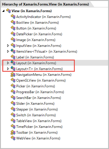
There's another category of views (outlined with red rectangle in Figure 10) that serve a different purpose. The Layout class is a View class that contains a collection of children views. It's responsible for arranging the children views into position in the UI. It also collaborates with each child to determine the final rendering size.
There are several Layout views included in the framework.
- ContentView
- Frame
- ScrollView
- AbsoluteLayout
- Grid
- RelativeLayout
- StackLayout
Each Layout view specializes in a layout strategy. Which layout you choose for your application depends on how you want the UI to look on the phone screen. I won't cover the details of each of these layouts today. Instead, let's look at the Layout and Layout<T> base classes (shown in Figure 11) and see what they offer to the sub-classed items.
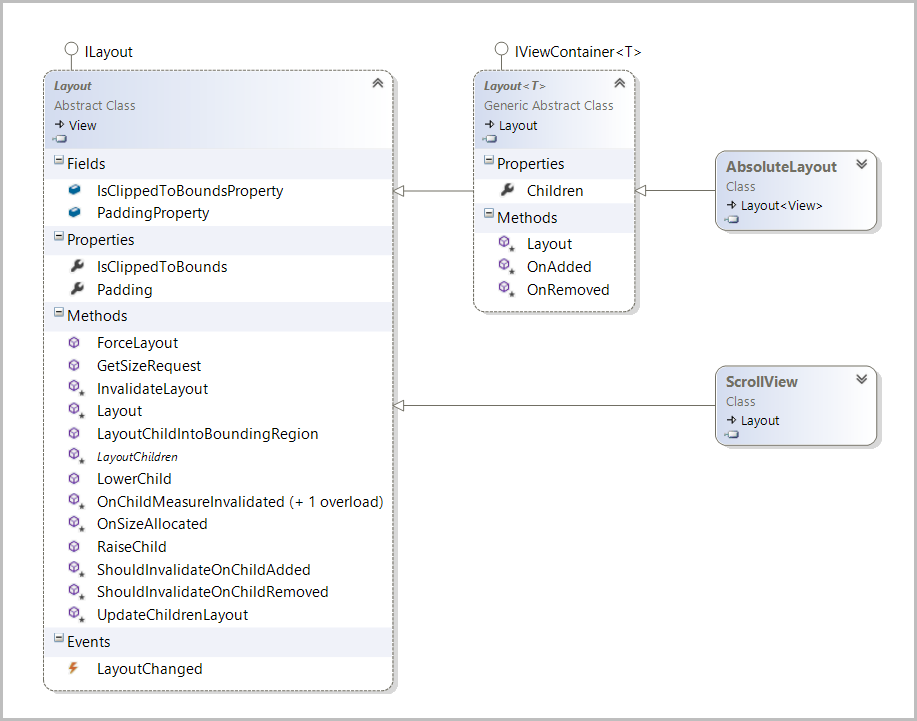
It seems obvious that there will be members in the Layout class that help manage the child items. For example, I see the RaiseChild and LowerChild methods listed in the object viewer. It appears that they're responsible for moving child items forward and backward through the z-axis of the visual stack. The IsClippedToBounds property determines whether the Layout container clips the visual output of any child that extends beyond the Layout boundaries.
The Layout<T> class extends the Layout class. It's very sparse in new features. The main feature that it adds is generic typing of the child elements. In other words, you could create a Grid sub-class of Layout<T> that only contains GridCell views.
What's Next?
This concludes the tour of the main object hierarchy in Xamarin.Forms. Obviously there are hundreds of interesting items to explore further. In the upcoming issues of CODE Magazine, I'll explore these areas with you. In the meantime, get yourself a copy of Xamarin and have fun building a great cross-platform app.