

In Part 1 of this article you learned how to create a Windows 8 look and feel for your WPF applications. In Part 2 of this article you learned to create a few of the user controls that went into making the shell application. In this final article in this series, you will learn how to create the last few user controls that I used to create the Windows 8 Shell application. In this article, you will learn to put together a WPF Image button, an Image button with text and finally the main Tiles used for the primary navigation system.
A WPF Image Button
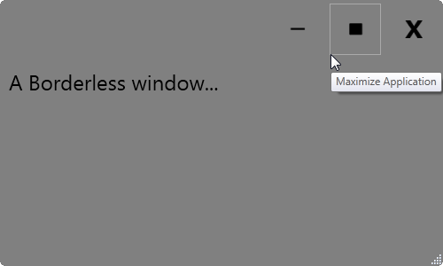
Instead of a normal button with just some text, sometimes you want a button that is just graphical. Yes, you can put an Image control in the Content of a normal Button control, but you still need to modify the button outline, and you might need to change the button style to suit your needs. A user control that simulates a button but contains just an image gives you this flexibility. Figure 1 shows an example of three of these custom Image button user controls to represent Minimize, Maximize and Close buttons for a borderless window. Notice the highlighted Image button has a gray rectangle around it. In addition to learning how to build this Image user control, you will also learn how to highlight using the VisualStateManager.
This Image user control is similar to the Button user control you built in Part 2 of this article. If you are not familiar with building user controls, you should go back and read Part 2 of this article series.
Building the WPF Image Button User Control
The XAML for this Image button user control contains a Border, an Image, and a Visual State Manager control. The code snippet listed below shows the definition for the Border and the Image. I'll show the Visual State Manager later in this article.
<Border Grid.Row="0" Name="borMain"
    Style="{StaticResource pdsaButtonImageBorderStyle}"
    MouseEnter="borMain_MouseEnter"
    MouseLeave="borMain_MouseLeave"
    MouseLeftButtonDown="borMain_MouseLeftButtonDown">

    <VisualStateManager.VisualStateGroups>
    ... MORE XAML HERE ...
    </VisualStateManager.VisualStateGroups>

    <Image Style="{StaticResource pdsaButtonImageImageStyle}"
           Visibility="{Binding Path=Visibility}"
           Source="{Binding Path=ImageUri}"
           ToolTip="{Binding Path=ToolTip}"/>
</Border>
The Border control, named borMain, is the parent control that contains the Visual State Manager and the Image that makes up this user control. The definition for this user control is in a DLL named PDSA.WPF that comes with the sample code for this article. The style definitions for both the Border and the Image controls are contained in a resource dictionary named PDSAButtonStyles.xaml. By placing all of your styles in a resource dictionary you can have a default set of styles while allowing a developer to override the dictionary with their dictionary of styles.
The Image control has bindings linked to the Visibility, Source and Tooltip properties. These bindings are created as dependency properties in the user control. Using properties allows you to specify what image and tooltip gets displayed and whether or not this button is visible.
The Visual State Manager Controls the Highlighting
The Visual State Manager (VSM) control is used to highlight the border of your button as your mouse hovers over it. Two different states are created within the VSM; MouseEnter and MouseLeave. In the MouseEnter state you create a ColorAnimation to modify the BorderBrush color of the Border control. In the sample application, the color to animate is set to DarkGray; however, you can set this to any color you want within your own resource dictionary.
<VisualStateManager.VisualStateGroups>
   <VisualStateGroup Name="MouseStates">
        <VisualState Name="MouseEnter">
            <Storyboard>
                <ColorAnimation To="DarkGray"
                                Duration="0:0:00.1"
                                Storyboard.TargetName="borMain"
                                Storyboard.TargetProperty="BorderBrush.Color" />
            </Storyboard>
        </VisualState>
        <VisualState Name="MouseLeave"/>
    </VisualStateGroup>
</VisualStateManager.VisualStateGroups>
This code sets the duration it takes to move from no highlight to the dark gray highlight to less than a second but feel free to modify this value. The TargetName of this storyboard is the name of the Border control which is borMain. Since you are specifying a single color for the border, you need to set the TargetProperty to BorderBrush.Color. You do not need a storyboard for the MouseLeave state. Leave this Visual State empty to put everything back the way it was before the MouseEnter event.
Writing the Mouse Events
To trigger the Visual State Manager to run its storyboard in response to the specified event, you respond to the MouseEnter event on the Border control. In the code behind for this event, call the GoToElementState() method of the Visual State Manager object exposed by the user control. To this method you will pass in the target element (borMain) and the state (MouseEnter).
private void borMain_MouseEnter(object sender, MouseEventArgs e)
{
    VisualStateManager.GoToElementState(borMain, "MouseEnter", true);
}
You also need to respond to the MouseLeave event. In this event you call the VisualStateManager as well, but specify “MouseLeave” as the state to go to.
private void borMain_MouseLeave(object sender, MouseEventArgs e)
{
    VisualStateManager.GoToElementState(borMain, "MouseLeave", true);
}
The Resource Dictionary
Listing 1 shows the definition of the PDSAButtonStyles.xaml resource dictionary file contained in the PDSA.WPF DLL. You can use this dictionary as the default look and feel for any image button control you add to a window.
Listing 1: Use a resource dictionary so you can override the styles at a later date
< ResourceDictionary  ... >
    <!-- ************************* -->
    <!-- ** Image Button Styles ** -->
    <!-- ************************* -->
    <!-- Image/Text Button Border -->
    <Style TargetType="Border"  x:Key="pdsaButtonImageBorderStyle">
        <Setter Property="Margin" Value="4" />
        <Setter Property="Padding" Value="2" />
        <Setter Property="BorderBrush" Value="Transparent" />
        <Setter Property="BorderThickness" Value="1" />
        <Setter Property="VerticalAlignment" Value="Top" />
        <Setter Property="HorizontalAlignment" Value="Left" />
        <Setter Property="Background" Value="Transparent" />
    </Style>
    <!-- Image Button -->
    <Style TargetType="Image" x:Key="pdsaButtonImageImageStyle">
        <Setter Property="Width" Value="40" />
        <Setter Property="Margin" Value="6" />
        <Setter Property="VerticalAlignment" Value="Top" />
        <Setter Property="HorizontalAlignment" Value="Left" />
    </Style>
</ResourceDictionary>
Using the Button Control
Once you make a reference to the PDSA.WPF DLL from your WPF application, you will see the “PDSAucButtonImage” control appear in your toolbox. Drag and drop the button onto a window or user control in your application to see the following appear in your XAML:
<my: PDSAucButtonImage ... />
There will be some other attributes set on the above XAML, but you simply need to set the x:Name, the ToolTip and ImageUri properties. You will also want to respond to the Click event procedure in order to associate an action with clicking on this button. In the sample code that comes with this article (see the end of the article for download instructions) you will find the declaration of the Minimize button:
<my: PDSAucButtonImage
  x:Name="btnMinimize"
  Click="btnMinimize_Click"
  ToolTip="Minimize Application"
  ImageUri="/PDSA.WPF;component/Images/Minus.png" />
The ImageUri property is a dependency property in the PDSAucButtonImage user control. The x:Name and the ToolTip we get for free. You have to create the Click event procedure yourself in order to respond to the user clicking on your button.
The Click event for the PDSAucButtonImage user control is created in the code behind of this user control in the PDSA.WPF.dll. The complete definition in the user control looks like the following code snippet:
private void borMain_MouseLeftButtonDown(object sender,
    MouseButtonEventArgs e) {
        RaiseClick(e);
}

public delegate void ClickEventHandler(object sender, RoutedEventArgs e);
public event ClickEventHandler Click;

protected void RaiseClick(RoutedEventArgs e) {
    if (null != Click)
    Click(this, e);
}
Since a Border control does not have a Click event you will create one by using the MouseLeftButtonDown on the border to fire an event you create called “Click.”
In order to give an initial look and feel to your Image button, you will need to add a reference to the resource dictionary in the PDSA.WPF.dll. You can do this in your App.Xaml so it is available anywhere in your WPF application. Below is what this reference might look like:
<Application.Resources>
    <ResourceDictionary>
        <ResourceDictionary.MergedDictionaries>
           <ResourceDictionary Source=
               "/PDSA.WPF;component/PDSAButtonStyles.xaml" />
        </ResourceDictionary.MergedDictionaries>
    </ResourceDictionary>
</Application.Resources>
You may override this resource dictionary on a specific window or user control or on an individual button. Just make sure you use the same style names. Other than that, you can make the styles look like whatever you want.
A WPF Image/Text Button
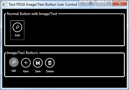
In Figure 2 you can see two different kinds of buttons. In the top row is a WPF button where the content of the button includes a Border, an Image and a TextBlock. In the bottom row are four individual user controls that have a Windows 8 style look and feel. The “Edit” button in Figure 2 has the mouse hovering over it so you can see how it looks when the user is about to click on it.
The Image/Text User Control
An application bar style button is a little more complicated than the Image control you just learned to create. However, the basics are very similar. Listing 2 shows the outline of this Image/Text user control. I removed the Visual State Manager control so you can see the controls without the animation.
Listing 2: A Image/Text user control is built using a Grid, a Border, an Image and TextBlock control
<Grid>
    <Grid.RowDefinitions>
        <RowDefinition Height="Auto" />
        <RowDefinition Height="Auto" />
    </Grid.RowDefinitions>
    <Border Grid.Row="0"
            Name="borMain"
            Style="{StaticResource pdsaButtonImageTextBorderStyle}"
            MouseEnter="borMain_MouseEnter"
            MouseLeave="borMain_MouseLeave"
            MouseLeftButtonDown="borMain_MouseLeftButtonDown"
            ToolTip="{Binding Path=ToolTip}">

        <VisualStateManager.VisualStateGroups>
        ... MORE XAML HERE ...
        </VisualStateManager.VisualStateGroups>

        <Image Source="{Binding Path=ImageUri}"
               Style="{StaticResource pdsaButtonImageTextImageStyle}" />
    </Border>
    <TextBlock Grid.Row="1"
               Name="tbText"
               Style="{StaticResource pdsaButtonImageTextTextBlockStyle}"
               Text="{Binding Path=Text}" />
</Grid>
The Image/Text user control contains a Grid, a Border, an Image and a TextBlock control all combined to form the buttons shown in row 2 of Figure 2. The above XAML is fairly easy to understand as this is just combining standard controls into a format that gives you the look required for your button. The Border, the Image and the TextBlock have a named style applied to them. You'll find the definition for this user control in the PDSA.WPF.dll as well as a default resource dictionary. The resource dictionary will provide a default look and feel like that shown in Figure 2, however, you can make a copy of this resource dictionary and change the look to meet your needs.
Adding the Visual State Manager
To give the user feedback when they hover over the Image/Text button you use the Visual State Manager to change attributes of controls. In the VSM shown in Listing 3 there are two visual states: MouseEnter and MouseLeave. MouseLeave, which is empty, tells the VSM to return all properties changed during the MouseEnter back to their original values. The MouseEnter state is where you modify three properties of the Border control. First, you modify the BorderBrush color to the color specified in the style named pdsaButtonImageTextBorderHoverColor. You also modify the Background color of the border to the color specified in the style name pdsaButtonImageTextBackHoverColor. Finally, the Margin property of the Border control is modified slightly in order to make the button appear to move upwards on the screen.
Listing 3: A Visual State Manager can change attributes of several controls that make up your user control
<VisualStateManager.VisualStateGroups>
    <VisualStateGroup Name="MouseStates">
        <VisualState Name="MouseEnter">
            <Storyboard>
                <ColorAnimation
                    To="{StaticResource pdsaButtonImageTextBorderHoverColor}"
                    Duration="0:0:00.1"
                    Storyboard.TargetName="borMain"
                    Storyboard.TargetProperty="BorderBrush.Color" />
                <ColorAnimation
                    To="{StaticResource pdsaButtonImageTextBackHoverColor}"
                    Duration="0:0:00.1"
                    Storyboard.TargetName="borMain"
                    Storyboard.TargetProperty="Background.Color" />
                <ThicknessAnimation
                    To="{StaticResource pdsaButtonImageTextHoverThickness}"
                    Duration="0:0:00.1"
                    Storyboard.TargetName="borMain"
                    Storyboard.TargetProperty="Margin" />
            </Storyboard>
        </VisualState>
        <VisualState Name="MouseLeave" />
    </VisualStateGroup>
</VisualStateManager.VisualStateGroups>
The XAML in the code snippet below shows the default styles used in the Visual State Manager. These styles come from the PDSAButtonStyles.xaml resource dictionary contained in the PDSA.WPF DLL.
<!-- Border color while hovering over button -->
<Color x: Key="pdsaButtonImageTextBorderHoverColor">
    Gray
</Color>
<!-- Background color while hovering over button -->
<Color x: Key="pdsaButtonImageTextBackHoverColor">
    Gray
</Color>
<!-- Thickness while hovering over button -->
<Thickness x: Key="pdsaButtonImageTextHoverThickness">
    4,2,4,4
</Thickness>
Writing the Mouse Events
To trigger the Visual State Manager to run its storyboard in response to the specified event, you respond to the MouseEnter event on the Border control. In the code behind for this event, call the GoToElementState() method of the VisualStateManager class exposed by the user control. To this method you will pass in the target element (borMain) and the state (MouseEnter). The VisualStateManager will then run the storyboard contained within the defined state in the XAML.
private void borMain_MouseEnter(object sender, MouseEventArgs e)
{
    VisualStateManager.GoToElementState(borMain, "MouseEnter", true);
}
Write code in the MouseLeave event and call the VisualStateManager's GoToElementState method and specify “MouseLeave” as the state to go to.
private void borMain_MouseLeave(object sender, MouseEventArgs e)
{
    VisualStateManager.GoToElementState(borMain, "MouseLeave", true);
}
Using the Image/Text Button Control
Just like the previous user control, you will need to make a reference to the PDSA.WPF.dll from your WPF application in order to use this control. Once you drag this control onto a window or user control, you just need to set the x:Name, the Text and ImageUri properties. You will also want to respond to the Click event procedure in order to associate an action with clicking on this button. In the sample code you download for this article, you will find the declaration of the Edit button:
<my : PDSAucButtonImageText
    Name="btnEdit"
    ImageUri="/PDSA.WPF;component/Images/Edit_White.png"
    Text="Edit"
    Click="btnEdit_Click" />
Creating a XAML Tile Control
One of the navigation mechanisms used in Windows 8 and Windows Phone is a Tile. A Tile is a rectangle that can have words and pictures that a user can click on. You can build your own version of a Tile in your WPF or Silverlight applications using a user control. With just a little bit of XAML and a little bit of code-behind you can create a navigation system like that shown in Figure 3.
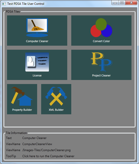
The WPF application shown in Figure 3 uses a WrapPanel to display a series of Tile objects. There are two styles defined in this Window to give us a large tile and a small tile. I'll show you these styles and describe the usage of the Tile later, but first let's look at how you can create a Tile user control.
The Tile User Control
In a WPF or Silverlight application, you can create user controls which are a composite of other controls grouped together as a single unit. You can then drag and drop these single unit user controls (Tiles for the purposes of this section of the article) onto a Window or user control from the Visual Studio Toolbox. To create a Tile you need a Border, Grid, Image and a TextBlock control. Of course you will need to style these to get the appearance you saw in Figure 3. You will also need to use a Visual State Manager to highlight the Tile the user is currently hovering over. Listing 4 shows the complete XAML for the Tile.
Listing 4: Creating a Tile is just like creating any other user control; you simply combine several normal controls together in a format to make a big rectangle for a user to click on
<Border x:Name="borMain"
        Style="{StaticResource pdsaTileBorderStyle}"
        MouseEnter="OnMouseEnter"
        MouseLeave="OnMouseLeave"
        MouseLeftButtonDown="OnMouseLeftButtonDown">
    <VisualStateManager.VisualStateGroups>
        <VisualStateGroup Name="MouseStates">
            <VisualState Name="MouseEnter">
                <Storyboard>
                    <ColorAnimation
                        To="{StaticResource pdsaTileBorderHighlightColor}"
                        Duration="00:00:00"
                        Storyboard.TargetName="borMain"
                        Storyboard.TargetProperty="BorderBrush.Color" />
                </Storyboard>
            </VisualState>
            <VisualState Name="MouseLeave" />
        </VisualStateGroup>
    </VisualStateManager.VisualStateGroups>
    <Grid>
        <Grid.RowDefinitions>
            <RowDefinition Height="*" />
            <RowDefinition Height="Auto" />
        </Grid.RowDefinitions>
        <Image Grid.Row="0"
               Name="imgMain"
               Style="{StaticResource pdsaTileImageStyle}"
               Source="{Binding TileImageUri}" />
        <TextBlock Grid.Row="1"
                   Name="tbText"
                   Style="{StaticResource pdsaTileTextBlockStyle}"
                  Text="{Binding TileText}" />
    </Grid>
</Border>
The Border, the Image and TextBlock all have a style applied to them. A set of default styles are contained in a resource dictionary that comes with the user control in the PDSA.WPF.dll. You can override the default resource dictionary with one of your own to create a different look and feel for your Tiles. You only need to keep the names of the styles the same.
The Visual State Manager in the XAML has just a single ColorAnimation when the mouse enters the Border. This ColorAnimation will change the border brush color to the value specified in the style named pdsaTileBorderHighlightColor. The Border will respond to the MouseEnter and MouseLeave events and call the Visual State Manager to move to the states defined in the XAML as shown in the code below:
private void OnMouseEnter(object sender, MouseEventArgs e)
{
    VisualStateManager.GoToState(this, "MouseEnter", true);
}

private void OnMouseLeave(object sender, MouseEventArgs e)
{
    VisualStateManager.GoToState(this, "MouseLeave", true);
}
Creating the Tile Click Event
In addition to the MouseEnter and MouseLeave events, the user control must also raise a Click event. The Click event for the Tile control is different from the other user controls you have created thus far. When the MouseLeftButtonDown event procedure is fired on this user control, an instance of a class called PDSATileEventArgs is created and a Click event is raised as shown in Listing 5.
Listing 5: In order to pass additional information to an event procedure, create your own custom class that inherits from the EventArgs class
private void OnMouseLeftButtonDown(object sender, MouseButtonEventArgs e)
{
    PDSATileEventArgs args = new PDSATileEventArgs();

    args.Text = this.Text;
    args.ViewName = this.ViewName;
    if(ImageUri != null)
        args.ImageUri = this.ImageUri.ToString();
    if(ToolTip != null)
        args.ToolTip = this.ToolTip.ToString();

    RaiseClick(args);
}

public delegate void TileClickEventHandler(object sender, PDSATileEventArgs e);

public event TileClickEventHandler Click;

protected void RaiseClick(PDSATileEventArgs e)
{
    if (null != Click)
    Click(this, e);
}
As you can see in the MouseLeftButtonDown event, you create a new instance of a PDSATileEventArgs class. You gather the dependency properties from the user control and place those into this new PDSATileEventArgs object. Next, you call the RaiseClick method passing in this object. The Click event is raised from this method passing in the current tile object and the instance of the PDSATileEventArgs class.
public class PDSATileEventArgs : EventArgs
{
    public PDSATileEventArgs() : base()
    {
        ViewName = string.Empty;
        Text = string.Empty;
        ImageUri = string.Empty;
        ToolTip = string.Empty;
    }

    public string ViewName { get; set; }
    public string Text { get; set; }
    public string ImageUri { get; set; }
    public string ToolTip { get; set; }
}
Create a Tile in Your Application
After you have built the Tile user control you add a reference to the PDSA.WPF.dll that contains this user control, which will now show up in the Visual Studio Toolbox. Drag and drop a Tile control onto a window and set the appropriate properties via the Property window or directly in the XAML. Below is the XAML for the “Computer Cleaner” Tile shown in the upper left-hand corner of Figure 3.
<my: PDSAucTile
    Name="tileComputerCleaner"
    Text="Computer Cleaner"
    ViewName="ComputerCleanerView"
    ToolTip="Click here to run the Computer Cleaner"
    ImageUri="/Images-Tiles/ComputerCleaner.png"
    Click="tile_Click"
    Style="{StaticResource tileLarge}" />
Responding to the Click Event
When you click on a Tile the Click event will fire. This event has a normal event procedure signature where you are passed the object that fired the event and an event argument object. The event argument object is an instance of the PDSATileEventArgs class. This event argument object contains the Text, ViewName, ImageUri and the ToolTip properties that you set in the XAML. In the sample code below these values are simply displayed in text blocks on the main window.
private void tile_Click(object sender,
PDSATileEventArgs e)
{
    tbText.Text = e.Text;
    tbViewName.Text = e.ViewName;
    tbImageUri.Text = e.ImageUri;
    tbToolTip.Text = e.ToolTip;
}
In your application you might use a switch statement on the ViewName property to figure out which view to display as shown below:
private void tile_Click(object sender, PDSATileEventArgs e)
{
    switch (e.ViewName) {
        Case "ComputerCleanerView":
        // Display the Computer Cleaner View
        break;

        Case "LicenseView":
        // Display the License View
        break;
    }
}
You should assign a unique ViewName to each tile on your window in order to easily determine which tile was clicked upon and thus what action your program needs to take.
Summary
In this final installment of this three-part article you learned how to create two additional button controls. One button just displayed an image while the second one displayed an image and text on one button and responded by moving and changing the border color when the user hovered over the button. Creating these user controls becomes quite trivial once you learn the basics. A Windows Phone or Windows 8 tile is very easy to create in XAML as shown in this article. The sample for this article uses a WrapPanel to display a set of tiles. In the WPF Windows 8 style shell application shown in Part 1 of this article series, a ScrollViewer control was used to display a horizontally scrolling set of tiles. With just a small set of user controls you can easily create new methods of navigation for your user.