


Developers of LightSwitch applications are not limited to the set of standard UI controls that come “out of the box.” If your application has specific requirements that are not covered by the standard control set, you can use third-party LightSwitch controls or use regular Silverlight controls (also called “custom controls”) to enhance your UI. In this article I will show you how to get started with custom controls and how to make custom controls and screens work together (interact).
LightSwitch client applications use the Silverlight framework as a foundation to build upon. LightSwitch controls that you work with in the IDE are, at the core, just Silverlight controls, but they are enhanced with information and functionality that make it possible for the LightSwitch runtime to relieve the developer from many routine tasks associated with UI data binding, UI layout, and command enablement. A custom control is a regular Silverlight control that is part of the LightSwitch application UI (a screen). The main difference between LightSwitch controls and custom controls is that a custom control does not have LightSwitch-specific information associated with it. Therefore LightSwitch treats it as a “black box” and it is up to the developer to specify what data the control should display (data-bind the control to the screen) and to handle any events the control might raise.
So creating custom controls for LightSwitch is as simple as creating Silverlight controls. To get started with Silverlight, see http://www.silverlight.net/getstarted/. In this article I’ll show you how you can use your custom Silverlight controls on LightSwitch screens.
Creating custom controls for LightSwitch is as simple as creating Silverlight controls.
Screen Content Tree and Custom Controls
A screen in a LightSwitch application is built of three elements:
To add a custom control to a screen, the developer replaces the standard (default) control on a content item with a different (custom) control.
Example: Use Rating Control for Shipper Rating
Let’s say you are building a database of shippers that are available to ship goods from your manufacturing facility to various parts of the country. For now you will focus only on three pieces of information: the shipper’s name, phone number, and rating. You will use the Rating control from the Silverlight toolkit, so if you do not have the toolkit installed yet, you can get it from http://silverlight.codeplex.com/.
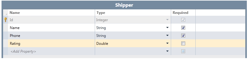
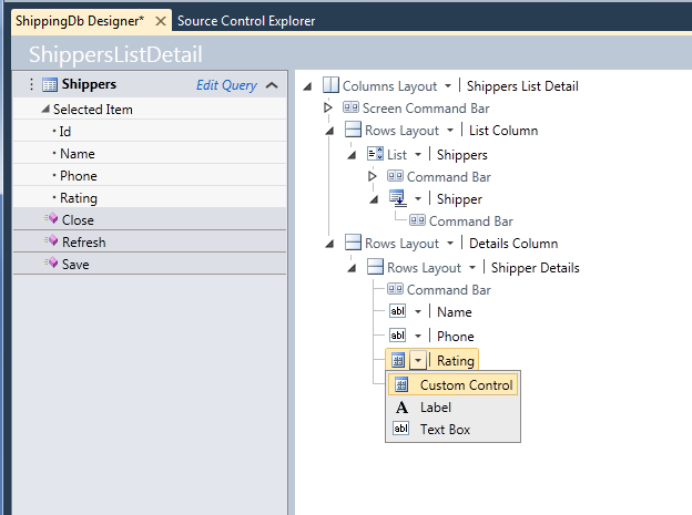
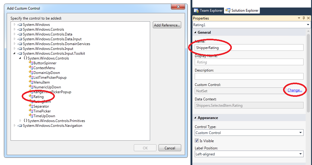
Open Visual Studio, create a new LightSwitch application, and then create a Shipper entity (see Figure 1). Next, create a screen for the Shipper entity using the List and Detail templates and make sure you have the details included. In the details section, expand the control dropdown and choose “Custom Control” (see Figure 2). Open the properties window, rename the control to “ShipperRating”, and then click “Change” link next to the Custom Control property to select the custom control (Figure 3). You will need to add a reference to the System.Windows.Controls.Input.Toolkit assembly where the Rating control resides. You’ll find it in the directory where the Silverlight toolkit is installed, e.g., “C:\Program Files (x86)\Microsoft SDKs\Silverlight\v4.0\Toolkit\Apr10\Bin”.
The final step is to set up data binding between the control and the screen. In the screen designer, click the “Write Code” button in the toolbar and override the screen’s Created method (see Listing 1). In this method, you add an event handler for the ControlAvailable event, which is raised when the LightSwitch runtime instantiates the control. In my example, this happens right after the screen is displayed; however, depending on screen content, the control might not be initially visible and thus Silverlight might not create it immediately, so having an event for that helps.
In the event handler, set a couple control properties to give it the familiar 5-star look, and then bind it to the content tree. If you run the application now, you will see that the screen behaves as expected. Just make sure to put a value between zero and one when adding new Shippers via the standard data adding dialog, which does not use the fancy Rating control. A value of 0.2 gives 1 star, a value of 0.4 gives two stars, and so on. Try adding a New Shipper screen to replace the standard dialog and incorporate the Rating control into it-this will round up the experience.
Binding Controls to Screen Content Tree Items
When you replace a standard LightSwitch control with a custom control on some screen content tree item, the LightSwitch runtime sets the data context for the custom control to this content item. The content item does not just expose screen data; it has several properties that aid the UI layer (controls) in providing the best possible data-editing experience. Some examples follow:
- DisplayName property is used to show a caption.
- Description property is used for a helpful tooltip.
- IsProcessing property indicates whether underlying data is available or still being loaded from the database.
- DataError property contains error information if the data load fails.
For the purposes of using custom controls, the Value property is the most important: this is the property that returns the underlying piece of screen data that the content item represents. So in this case:
var b = new Binding("Value");
b.Mode = BindingMode.TwoWay;
rc.SetBinding(Rating.ValueProperty, b);
The content item represents the Shipper.Rating property, and the “Value” binding path causes the Rating.Value to be bound to Shipper.Rating, which is exactly what you want. Use the TwoWay mode for the binding, because the default is OneWay and that would preclude you from setting the Rating value by clicking the desired number of “stars.”
Keeping Applications Responsive
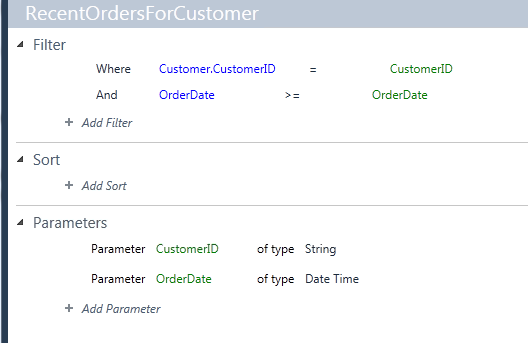
Suppose your application has a screen that displays Customer data; one piece of information that you want to show is the total value of Orders in the last 30 days (you will use the Northwind database for this example). In LightSwitch it is very easy: you create a parameterized query that returns relevant Orders (see Figure 4), and then create a computed property that does the calculation:
partial void RecentOrderTotal_Compute(
    ref decimal result)
{
    result = 0;

    foreach (Order o
    in this.DataWorkspace.Northwind.
    RecentOrdersForCustomer
    (
        this.CustomerID,
        DateTime.Today-TimeSpan.FromDays(30))
    )
    {
        foreach (Order_Detail od
        in o.Order_Details)
        {
            result += od.UnitPrice * od.Quantity;
        }
    }
}
This is simple but not the most efficient way to compute the desired result, because for each Order you retrieve its OrderDetails separately-it would be better to retrieve all relevant OrderDetails in one round trip. Note that, even with this implementation, the application remains responsive when waiting for the RecentOrderTotal computation result-you can edit data, switch to a different screen, and so on. If you tried to re-implement the same computation in a WPF application or a Silverlight application with RIA services, you’d notice that this straightforward approach would not work. Depending on the data access API used, the application would either “freeze” for a short time whenever the computation happens, or the call to load data (e.g., the call to the DomainContext.Load() method if you used RIA services) would return without an error, but the data would not be immediately available. This is because if the application is supposed to perform a long-running operation (like the recent order total computation) and stay responsive, it has to perform the operation while simultaneously processing user input (mouse clicks, keystrokes) as it keeps coming. LightSwitch has been designed specifically to help you with that and it is the LightSwitch runtime that makes the simple code above work so well. The underlying mechanism is called dual threading.
If the application is supposed to perform a long-running operation and stay responsive, it has to perform the operation while simultaneously processing user input.
Every LightSwitch application creates all its UI and processes user input from a single thread (UI thread). Every screen also gets its own, separate thread for running all sorts of code that is not directly responsible for UI and user input handling. It is the screen thread, for example, that is used for evaluating computed fields like RecentOrderTotal. In this way the UI thread can focus on its main job and always be ready for user actions. See Table 1 for an explanation of how the screen thread and the UI thread cooperate to maintain application responsiveness. The most important information here is that it is the screen thread that “owns” screen data and executes all user code. This means that whatever code the developer writes, it will be executed on the screen thread by default. The controls for this article, on the other hand, operate on the UI thread, so there will be situations when you will need to pass data to the UI thread and execute portions of your code on the UI thread. The opposite situation occurs too: if the control initiates an operation (e.g., calls a screen method), a portion of the method may need to ensure that the method is executed on the screen thread.
It is the screen thread that “owns” screen data and executes all user code.
To ensure that a piece of code runs on the appropriate thread, the developer uses a dispatcher. There are three dispatchers available in LightSwitch applications:
- Main dispatcher (Dispatchers.Main) is the UI thread dispatcher.
- Application dispatcher (available from Application object) is the dispatcher dedicated to running global application code, not associated with any specific screen.
- Screen dispatcher (Screen.Details.Dispatcher) is the screen thread dispatcher.
In the previous example you used the UI thread dispatcher for the data binding setup:
Dispatchers.Main.BeginInvoke(() =>
{
   Rating rc = e.Control as Rating;
   …
});
The BeginInvoke() method takes a delegate, which will be executed asynchronously by the thread associated with a given dispatcher. The code initiating the dispatch will not wait for the dispatched code to finish.
Control and Screen Interaction
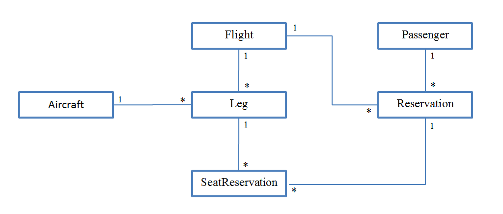
Consider an application that helps users make a flight reservation. You want to build a control that shows seat layout in an airplane and allows the user to pick a specific seat by clicking on it. (You can download the sample application for this article from the CODE Magazine website.) The control needs three pieces of data to function:
The data schema for this application is shown in Figure 5. You want the control to be usable from both LightSwitch applications, as well as ordinary Silverlight applications, so define a simple interface (view model interface) that the control will use to communicate with its host (see Listing 2). There are several ways to implement view model interfaces in a LightSwitch application:
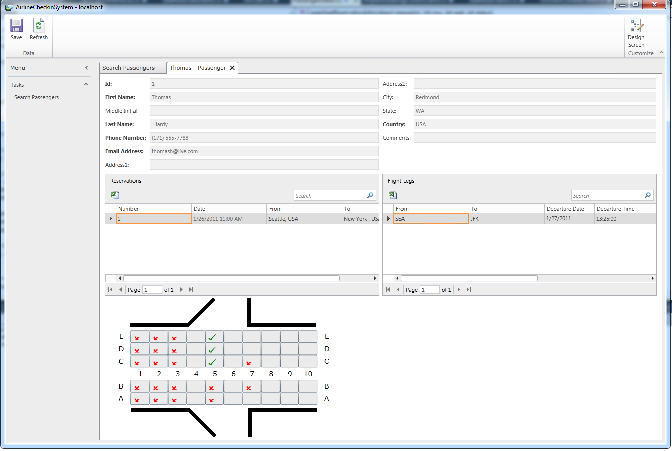
My example uses all these methods. The screen that uses the control is called PassengerDetail. It displays reservations that the passenger has made, along with flight, flight leg, and seat reservation information (see Figure 6). The seating control is initially placed in the right spot inside the content tree by means of a dummy screen property (DummyDataContext of type string). This is necessary because, as I explained earlier, every content tree element needs to be bound to some screen member. At run time, the dummy property is not used because the screen code overrides the control’s data context.
Every content tree element needs to be bound to some screen member.
For aircraft information, expose the IAircraftInfo interface directly from the Aircraft entity. This entity happens to have a Rows property and a SeatsInRow property, so all that remains is to expose the AislePositions property (right-click the entity in Solution Explorer and choose “View Table Code” to see the whole partial class):
public partial class Aircraft:
AirplaneUtilities.IAircraftInfo
{
    public  IList<int> AislePositions
    {
        get
        {
            var retval = new List<int>();
            retval.Add(this.Aisle1);
            if (this.Aisle2.HasValue)
                retval.Add(this.Aisle2.Value);
            return retval;
        }
    }
}
Seat reservation info is handled by a custom object, a simple class called SeatReservationInfo. This class resides in a separate class file added to the Client project (you can see it when you switch Solution Explorer to file view). The SeatReservationInfo class implements the ISeatReservationInfo and INotifyPropertyChanged interfaces. Information about seat reservations for selected flights is retrieved inside the SelectionChanged event for the FlightLegs screen collection property (you can jump to it by clicking the WriteCode button in screen designer and choosing the FlightLegs_SelectionChanged method). When a new flight leg is selected, the screen loads all associated seat reservations and constructs relevant SeatReservationInfo objects. It adds them to a private collection called currentSeatReservations (declared at the top of the screen partial class) and sets the data context of the seat reservation control to that collection (see Listing 3). Upon saving, the screen adjusts the corresponding SeatReservation entities and submits the changes to the server (Listing 4).
Finally, the creation of new seat reservation requests is handled by the screen directly-it implements the ISeatReservationInfoFactory interface (Listing 5). Note how the screen creates both the new SeatReservationInfo object (adding it to the seating control data context) as well as the corresponding SeatReservation entity. This keeps the screen data workspace and seating control view model synchronized. Also note how most of the work is done on the screen thread, but the final control view model (currentSeatReservations collection) update is done on the UI thread.
Conclusion
In this article I have shown how you can use custom controls to enhance the LightSwitch client application UI. The examples have shown binding custom controls to the screen content tree and various ways of providing the control with a customized view model if binding to the content tree directly is not sufficient. I have also described how the dual-threading model employed by the LightSwitch runtime affects custom control consumption and how to ensure that code runs on the appropriate thread by using screen and UI dispatchers. Hopefully this article provides enough information to enable you to deliver LightSwitch applications with UI that exceeds end user expectations!
For more information on building custom controls, please visit the LightSwitch Developer Center http://msdn.com/LightSwitch.
Listing 1: Setting up data binding for the Rating control
using System.Windows.Controls;
using System.Windows.Data;
using Microsoft.LightSwitch.Threading;

namespace LightSwitchApplication
{
    public partial class ShippersListDetail
    {
        partial void ShippersListDetail_Created()
        {
            var proxy = this.FindControl("ShipperRating");
            proxy.ControlAvailable += OnControlAvailable;
        }


        private void OnControlAvailable(object sender,
            ControlAvailableEventArgs e)
        {
            Dispatchers.Main.BeginInvoke(() =>
            {
                Rating rc = e.Control as Rating;
                rc.ItemCount = 5;
                rc.SelectionMode = RatingSelectionMode.Continuous;
                var b = new Binding("Value");
                b.Mode = BindingMode.TwoWay;
                rc.SetBinding(Rating.ValueProperty, b);
            });
        }
    }
}
Listing 2: Airplane seating control interface
namespace AirplaneUtilities
{
    public interface IAircraftInfo
    {
        // This interface assumes each row has equal number of
        // seats;this is not always the case in real airplanes,
        // but for the sake of the app you don't really care.
        int RowCount { get; }
        int SeatsInRow { get; }

        // Aisle positions are counted from left to right,
        // the aisle to the left of the leftmost column
        // of seats being position 0. For example, an airliner
        // with a 2-3-2 seating arrangement should
        // report two aisle positions: 2 and 5.
        // Assume that every aircraft has at least one aisle.
        IList<int> AislePositions { get; }
    }

    public enum SeatReservationStatus
    {
        Reserved = 0,   // Reserved by some other passenger.
        Available = 1,  // Can be reserved by the user of the app.
        Requested = 2,  // The user has requested given seat.
        Committed = 3   // User request was successful.
    }

    public interface ISeatReservationInfo
    {
        // Row and seat numbers start with 1.
        int Row { get; }
        int Seat { get; }
        int Status { get; set; }
    }

    // This is pretty much all you need.
    // The control data context will be a collection
    // of seat reservation info
    // i.e., IEnumerable<SeatReservationInfo>.
    // If seat reservation info is not available,
    // the seat will be assumed to be available.

    public interface ISeatReservationInfoFactory
    {
        // Request new seat reservation info.
        // If requestor is a FrameworkElement, set
        // its data context to the newly created seat
        // reservation info object.
        void CreateSeatReservationInfo(object requestor,
                  int row, int seat, int status);
    }
}
Listing 3: Constructing seat reservation info view model
partial void FlightLegs_SelectionChanged()
{
FlightLeg leg = this.FlightLegs.SelectedItem;
if (leg == null)
return;
Aircraft a = leg.Aircraft;
Dispatchers.Main.BeginInvoke( () => {
this.airplaneSeatingControl.DataContext = null;
this.airplaneSeatingControl.SetValue(
AirplaneUtilities.AirplaneSeatingControl.
AircraftInfoProperty, a);
this.Details.Dispatcher.BeginInvoke( () => {
this.LegId = leg.Id;
this.SeatReservationsForFlightLeg.Load();
this.currentSeatReservations.Clear();
foreach (SeatReservation seatReservation
in this.SeatReservationsForFlightLeg)
{
SeatReservationInfo sri;
if (<a href="http://seatReservation.Reservation.Passenger.Id">seatReservation.Reservation.Passenger.Id</a>
== this.PassengerId)
{
sri = new SeatReservationInfo(
seatReservation.Row,
seatReservation.Seat,
(int)AirplaneUtilities.
SeatReservationStatus.Committed);
}
else
{
sri = new SeatReservationInfo(
seatReservation.Row,
seatReservation.Seat,
(int)AirplaneUtilities.
SeatReservationStatus.Committed);
}
this.currentSeatReservations.Add(sri);
}
}
Dispatchers.Main.BeginInvoke(() =>
this.airplaneSeatingControl.DataContext =
this.currentSeatReservations);
});
});
}
Listing 4: Submitting a new seat reservation request
partial void PassengerDetail_Saving(ref bool handled)
{
    foreach (var sr in
    this.DataWorkspace.ApplicationData.Details.
    GetChanges().Where((e) =>
    e.Details.Name == "SeatReservation"))
    {
        SeatReservation seatReservation = sr as SeatReservation;
        Debug.Assert(seatReservation.Status ==
        (int) AirplaneUtilities.SeatReservationStatus.Requested);

        // I'll cheat here and assume that
        //all reservation requests will be granted.
        // In a real-world app the server would need to verify
        // that the seat has not been reserved already.
        seatReservation.Status = (int)
            AirplaneUtilities.SeatReservationStatus.Committed;
    }
}
Listing 5: Creating a new set reservation request
public void CreateSeatReservationInfo(object requestor,
int row, int seat, int status)
{
    this.Details.Dispatcher.BeginInvoke(() =>
    {
        SeatReservationInfo sri = null;

        FlightLeg leg = this.FlightLegs.SelectedItem;
        if (leg == null)
            return;

        // Create a SeatReservation
        var seatRes = this.DataWorkspace.ApplicationData.
                      SeatReservations.AddNew();
        seatRes.FlightLeg = leg;
        seatRes.Reservation = this.CurrentReservation;

        seatRes.Row = row;
        seatRes.Seat = seat;
        seatRes.Status = (int)status;

        // …then create corresponding SeatReservationInfo
        sri = new SeatReservationInfo(row, seat, status);

        var el = requestor as System.Windows.FrameworkElement;
        Debug.Assert(el != null);
        if (el != null)
        {
            Dispatchers.Main.BeginInvoke(() => {
                // This is all you need--the control
                // will be notified via INotifyCollectionChanged.
                this.currentSeatReservations.Add(sri);
            });
        }
    });
}
Table 1: Screen thread and UI thread responsibilities.
| Screen Thread | UI Thread |
|---|---|
| Manages screen data workspace and all data within it | Creates and manages all application UI (incl. all custom controls). |
| Evaluates validation rules and computed properties | Handles user input. Passes new data that user has entered to the screen thread. |
| Executes all user code (custom validation rules, computed properties, screen methods, etc.) | Requests data from the screen thread and exposes it to the UI via visual collections and data binding. On behalf of the screen thread, raises data-change notifications when necessary. |
| Initiates data load/save operations and processes their results | On behalf of the screen thread, executes calls to Silverlight and operating system APIs that expect the origin to be the UI thread. |
| Notifies UI thread about data changes (data loaded, programmatic data modification, etc.) |