


WPF excels at creating great looking applications.
One of the ways you can make your application look great is to add some shapes like circles, triangles and rectangles. However, the shapes in WPF do not allow you to add text (or any content) within the shape, as shapes are not containers.
In a WPF application I am building right now, I have a need to create different shapes and center text within those shapes. The shapes I need are rectangles, circles, ellipses and triangles. The problem is WPF shapes are not containers so you cannot add any text inside of them, but WPF is flexible enough that there are often several ways to work around this. In this article, I will show you a few different methods of centering text in each of these shapes.
Drawing an Ellipse/Circle Using a Border
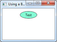
If you wish to put text into an ellipse or a circle, you can simulate this using a Border control and play with the Width, Padding and CornerRadius properties of the Border control. I used the code snippet below to draw text within an ellipse as shown in Figure 1.
<Border CornerRadius="50"
        Width="60"
        Margin="10"
        Padding="4"
        Background="Aquamarine"
        BorderBrush="Black"
        BorderThickness="1">
   <TextBlock HorizontalAlignment="Center"
              Text="Test" />
</Border>
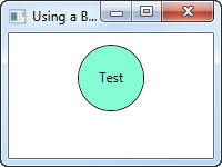
You can set the width and height of the Border control to create a circle as well. The XAML in the next snippet creates a circle with text in the middle, as shown in Figure 2.
<Border CornerRadius="50"
        Width="60"
        Height="60"
        Margin="10"
        Padding="0,20,0,0"
        Background="Aquamarine"
        BorderBrush="Black"
        BorderThickness="1">
   <TextBlock HorizontalAlignment="Center"
              Text="Test" />
</Border>
Draw a Triangle Using a Visual Brush
To create a triangle shape in WPF you use a Polygon control. If you remember your high school math, a Polygon is a series of connected lines that have the same start and end point. The XAML below creates a triangle; however, there is no text in it because a Polygon is not a container.
<Polygon Points="25,0 5,30 45,30"
         Fill="LightBlue"
         Stroke="Black"
         StrokeThickness="2" />
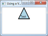
To add text like that shown in Figure 3, you need to use the Polygon control as the background of a TextBlock control. The XAML shown in Listing 1 is used to create Figure 3.
Two key things make this XAML work. First, you use the VisualBrush object of the Background of the TextBlock object to give you a place to put the Polygon control. Second, depending on the text that you fill into the TextBlock control, and the width and height of the TextBlock control, you will need to play with the Padding property to align the text to the correct location. Take the above XAML and put it in a new window and then adjust the height, width and text values. You will see that you need to adjust the Padding property to make the text fall into the correct location within the Polygon.
Listing 2 shows another example of a Visual Brush, this time using an Ellipse control. Figure 4 shows the results of the XAML in Listing 2.
Notice the Padding attribute is different than when using the Polygon control. You will need to make minor adjustments based on the shape that you are using and the height and width of the control, and the text you are putting into the TextBlock.
Position a Shape on a Canvas
Using a Visual Brush within a TextBlock control works, but it is not very re-usable code. The ultimate goal of this article is to show you how to move all of this code into one user control that you can use over and over again. Before you can learn that technique, you first need to learn to use a Canvas, a Shape, a TextBlock and MultiBinding converters.
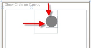
You use a WPF Canvas control to position child controls at a specified point on the Canvas. I created Figure 5 by placing a shape (you can use any control) at a certain point by setting the attached properties “Canvas.Top” and “Canvas.Left”. In Figure 5 you can see that the circle is positioned 20 points below the top of the Canvas and 40 points to the right of the Canvas’ leftmost border. I used the XAML below to create Figure 5.
<Canvas Name="cnvMain"
        Width="80"
        Height="80">
  <Ellipse Canvas.Top="20"
           Canvas.Left="40"
           Width="40"
           Height="40"
           Fill="Gray" />
</Canvas>
Place a Shape within a Canvas
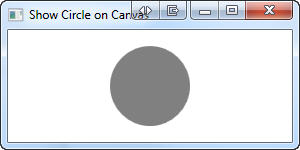
Most of the time, you want a shape to take up the same amount of width and height as the Canvas. So, you can simply set the Width and Height properties of both the Canvas control and the Shape control to be exactly the same. Since the Shape control is the child within the Canvas, it will fill up the whole Canvas. Note that you do not need to specify the Canvas.Top and Canvas.Left as the default for these is zero (0) for any child control placed in a Canvas as shown in the following XAML.
<Canvas Name="cnvMain"
        Width="80"
        Height="80">
  <Ellipse Width="80"
           Height="80"
           Fill="Gray" />
</Canvas>
Bind Ellipse Width and Height to Canvas
The problem with the above XAML is that if you wish to change the width and the height of the Canvas and you want the shape to be the exact same height, you need to change four numbers. Instead of hard-coding the numbers on the Shape control, you can take advantage of the element-to-element binding features of WPF. Below is an example of binding the Width and Height of the ellipsis to the Width and Height of the Canvas. The XAML below will produce the circle shown in Figure 6.
<Canvas Name="cnvMain"
        Width="80"
        Height="80">
  <Ellipse
       Width="{Binding ElementName=cnvMain,
                       Path=ActualWidth}"
       Height="{Binding ElementName=cnvMain,
                        Path=ActualHeight}"
       Fill="Gray" />
</Canvas>
Using a MultiBinding Converter
Now that you have a Shape within a Canvas you can place a TextBlock in the center of the Canvas to display text in the middle of that Shape. To center a TextBlock in the middle of a Canvas you need to take the width of the Canvas and subtract the width of the TextBlock, then divide this by 2 to get the value for the Left property. You use the same calculation for height to get the Top property of where to position the TextBlock in relation to the top of the Canvas.
It would be really convenient if you could use an expression in a WPF binding since you could then perform this calculation, but you can’t. So, instead, you need to pass the width of the Canvas and the width of the TextBlock to some code you write, and also the height of the Canvas and TextBlock. This is where a MultiBinding converter comes in very handy.
The result of the MultiBinding converters, shown in Listing 3, is to set the “Canvas.Left” and “Canvas.Top” properties of the TextBlock control. If you are familiar with a normal WPFbinding markup extension, you understand how a converter class is used to convert a single input value and produce a single output value that you assign to a property. A MultiBinding converter allows you to pass more than one value to a converter class. Notice the “Converter={…}” attribute uses a StaticResource called Midvalue. This static resource is defined in the Window.Resources section of this window as follows:
<Window.Resources>
  <src:MidpointValueConverter x:Key="MidValue" />
</Window.Resources>
The MidPointValueConverter class implements the IMultiValueConverter interface. This interface defines the Convert and ConvertBack methods just like a normal value converter method. It is your job to write the code to take the multiple inputs that are passed to the “values” parameter to the Convert method and return a single value that can be used to set the Left property. Listing 4 shows the MidPointValueConverter class.
In the MidPointValueConverter class you grab the two values passed in, which are the total width/height of the Canvas, and then the total width/height of the TextBlock control. You can then subtract those two values and divide by 2 to get the location of either the Left or the Top property.
Notice that you can also pass in an “extra” value in the “parameter” parameter. You can use this extra value if you want to move the TextBlock control down or to the right depending on the shape you use. For example, if you are using a triangle with the point of the triangle at the top, you might want to move the text a little lower into the widest part of the triangle instead of right in the middle of the triangle. Or, if you have a triangle where the point is to the right, then you might want to move the text a little over to the left. You set this “extra” parameter as the ConverterParameter attribute on the MultiBindingXAML element as shown in Listing 5.
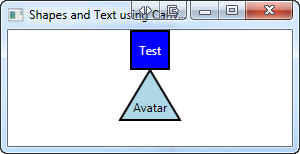
Figure 7 shows the results of the rectangle with text in it, and the result of using a polygon with the ConverterParameter set.
Creating a User Control for Hosting Shapes
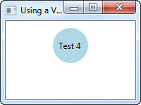
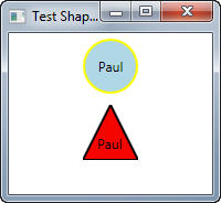
So, up to this point you have now learned how to create shapes and center text within those shapes using a couple of different methods. Now it is time to wrap up all this functionality into a nice, re-usable user control. In Figure 8 you see a couple of shapes that were created using a user control called “ucShape”. The first one draws a circle with the name “Paul” in it while the second one is a triangle.
Listing 6 shows the XAML used to create the circle in Figure 8. Notice each of the properties you can set on the user control. You can set the text to display on the shape using the TextToDisplay property. You use the Shape property to specify which type of shape you wish to display. You can use six different shapes with this user control; Rectangle, Square, Triangle, InvertedTriangle, Ellipse and Circle. Other properties that you can set include the color of the shape, the text, and the height and width of the shape.
Listing 7 shows the XAML code that draws the triangle shown in Figure 8. I’ve sent the ShapeToCreate property in this sample to “Triangle”. Notice the additional properties HeightOffset and WidthOffset. Normally the text is centered directly in the middle of the shape but with a triangle you will want to move the text to the fattest part of the triangle. These two additional properties adjust the text up, down, left or right.
Build a Shape User Control
To create your own shape user control you add a user control named ucShape to your project and add each of the properties shown in Listing 7. You will need to set up an enumeration for each shape as seen in the code below.
public enum ShapeEnums
{
  Rectangle,
  Square,
  Triangle,
  InvertedTriangle,
  Ellipse,
  Circle
}
You create the appropriate property get and set statements within the user control for each of the properties in Listing 7. I am not going to list the code for those here as I assume you know how to create normal properties. You can get the complete source code (in C# or VB) for this user control by downloading the sample code at www.pdsa.com/downloads.
The User Control XAML
Listing 8 is the complete XAML for your ucShape user control. A Canvas control is the container control for the entire user control. You’ll use the Canvas control to center the text at a specific point on the control. Notice that you do not use a shape control in the user control. The code will create the shape at run time by examining the ShapeToCreate property and adding the appropriate shape onto the Canvas at the appropriate location.
Notice the binding extensions on the Canvas control to the ActualWidth and ActualHeight properties of the user control. When you set the Width and Height properties on the user control these values will be used to set the Canvas to the same height.
The TextBlock control is contained within the Canvas control, but no other properties are set on this control. The properties such as where to place the TextBlock control on the Canvas, the Foreground color, the text, etc., will be set dynamically at run time based on the properties you set on the user control.
Loading the User Control
When an instance of the ucShape user control is loaded, the code creates the shape based on the ShapeToCreate property. The appropriate properties on the TextBlock control such as the Text, the Top and Left will also be set at this time. The Top and Left properties of the TextBlock will be set through the MultiBinding converter created in code this time as opposed to in the XAML.
Listing 9 shows the code for the Loaded event on the ucShape user control. This event procedure calls a method named CreateShape which is where the logic for creating each of the shapes is located. If a valid shape is returned from the CreateShape method, then that shape is inserted as the first control on the Canvas control.
The Loaded event procedure sets the Foreground property on the TextBlock control from the TextColor property set when the user control was declared. Finally, the MultiBinding converter for the Left and Top properties on the TextBlock control are created by calling the SetWidthMultiBinding and SetHeightMultiBinding. You will see this code a little later in this article.
The CreateShape Method
The CreateShape method (Listing 10) is fairly straight-forward WPF code. It contains a switch statement that checks the ShapeToCreate property. Based on that property, the appropriate shape is created and appropriate Width and Height properties on the shape are bound to the Width and Height properties on the Canvas control.
Create a MultiBinding in Code
In Listing 5 you saw how to use a MultiBinding converter to pass in two parameters from XAML and get a single value returned. Since you have moved all of the code into the user control, you will now create these MultiBinding converters in code too. Listing 11 shows the code for calculating the Left and Top properties for the TextBlock. Yes, you could have still created the MultiBinding converters in XAML, but I thought it would be good to show you how to perform the same thing using WPF code.
Summary
In this article, you learned how create text centered on a shape using a few different methods. It just goes to prove that there are always several methods to accomplish the same thing in WPF. For a quick and dirty approach, using a VisualBrush within a TextBlock works quite well. Using a user control is the best approach when you want to re-use the shape and text over and over again. You can place the user control and all the associated code into a DLL to reuse in many applications.