


Last issue I gave you a 'hit-the-ground-running' introduction to custom Web control development and showed you how to build a renered control and an inherited control.
In this issue you'll complete your inherited control by adding styling, sizing capabilities, as well as instruct it how to raise events. Afterward you will jump into building the last control of the series, the EmailContact control, bringing together the previous two controls with some business functionality into a powrful composite Web control.
In the first part of this article (CoDe Magazine, September/October 2005) you learned how to create an inherited Web control, as well as a fairly functional rendered Web control. In part two of this article you’ll learn three professional touches for your custom Web control. First, you’ll learn how to make all parts of your custom control resize correctly. Next, you’ll learn how to capture an event when the button is clicked or when text in the textbox changes. Finally, you’ll learn how to add basic styling.
Control Sizing
When you drop any Web control on a form, you’re probably used to sizing it by dragging one of its sizing points in whatever direction you want. The problem here is that the Web control you’re building consists of three HTML elements, and you want to be able to size each one individually to give the FormField control maximum usefulness. The built-in Width and Height property that the control has comes from the Control class that you are ultimately inheriting from, and it corresponds to the control as a whole. If you try to resize the control using these properties as it currently stands, nothing happens. This is because you have not added sizing attributes to the contained elements, so they stay exactly as-is. I’m going to do something later with these existing properties, but for now I want you to add two properties called CaptionWidth and ButtonWidth. For the purposes of this article, I’m only going to show you how to deal with widths, but the downloadable code contains code to handle heights as well. I left out a width property for the textbox for a reason, as I’ll explain later.
It’s a good idea to use a Case statement (switch in C#) as opposed to an If statement. This sets you up for any future enhancement to your control.
A property that handles height or width for an element is of type Unit. Here’s the code for the CaptionWidth property.
In VB.NET:
Public Property CaptionWidth() As Unit
   Get
      If CType( _
      ViewState("CaptionWidth"), Object) _
      Is Nothing Then
         Return Unit.Pixel(130)
      End If
      Return CType( _
      ViewState("CaptionWidth"), Unit)
   End Get
   Set(ByVal Value As Unit)
      ViewState("CaptionWidth") = Value
   End Set
End Property
In C#:
public Unit CaptionWidth
{
   get
   {
      if (((object)
      ViewState["CaptionWidth"]) == null)
         return Unit.Pixel(130);
      return ((Unit)
      ViewState["CaptionWidth"]);
   }
   set
   {
      ViewState["CaptionWidth"] = value;
   }
}
As you can see, the same ViewState-oriented property technique is used here as described earlier in the article. The Unit object is serializable so it can be fully persisted in the ViewState variable. Now that you’ve added the new properties, you need to do something with them. Remember that earlier I taught you that you can use the AddAttribute method of the HtmlTextWriter object to add tag attributes to the upcoming RenderBeginTag call. That’s exactly how you’re going to set the Width attribute to the ‘span’ tag and ‘input’ tag for the button, with one minor difference I’ll explain in a minute.
output.AddStyleAttribute(
   HtmlTextWriterStyle.Width,
   this.CaptionWidth.ToString());
And of course, you would have a similar line for the ButtonWidth property. Now you can set these properties individually to adjust the width of the caption and the button. As you realized, there’s one element of the Web control whose width I have not handled this way. In fact, there’s a reason I haven’t yet showed you how to handle this element. To make the control more programmer-friendly, I’m letting the textbox take the remaining width of the entire control; that is the total width of the Web control minus the width of the caption and the button (and don’t forget those two spaces you inserted between elements-calculated to be 10 pixels). The value that you’re going to use to set the width of the textbox will consist of the total width of the control (the Width property) minus the value of CaptionWidth, minus the value of ButtonWidth, and minus 10. The subtraction of the ButtonWidth value will depend on the setting of the ButtonVisible property and the number 10 accounts for the extra spaces rendered between the elements. I derived the number 10 by trial and error to see what looked best in the designer. You’ll use the calculated value to set the Width attribute of the textbox’s “input” tag.
In VB.NET:
Dim i_Width As Integer = _
CType(Me.Width.Value, Integer) -
(CType(Me.CaptionWidth.Value, Integer) - 10)

If Me.ButtonVisible Then
   i_Width -= CType( _
   Me.ButtonWidth.Value, Integer)
End If

If i_Width < 20 Then i_Width = 20

output.AddStyleAttribute( _
HtmlTextWriterStyle.Width, i_Width.ToString())

output.RenderBeginTag(HtmlTextWriterTag.Input)
In C#:
int i_Width = ((int)(this.Width.Value)) -
((int)(this.CaptionWidth.Value) - 10);

if(this.ButtonVisible)
   i_Width -= ((int)(this.ButtonWidth.Value));

if (i_Width < 20)
   i_Width = 20;

output.AddStyleAttribute(
HtmlTextWriterStyle.Width, i_Width.ToString());

output.RenderBeginTag(HtmlTextWriterTag.Input);
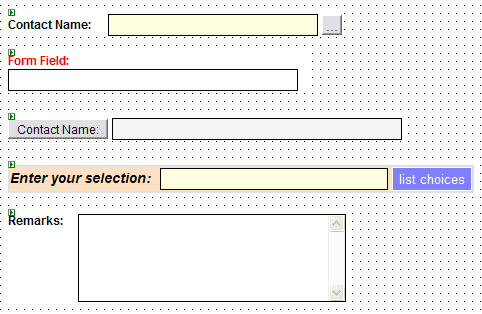
Notice that you’re also ensuring a minimum total width of 20 for the control. In the downloadable code for the finished FormField control (Figure 1), I also handle the Width property to account for percentages as well as pixel entry as its value. This will become necessary when I get to the composite control later, but for now I’m not going to worry about it. Another thing to note is that you’re using a different method from the AddAttribute you used before. The AddStyleAttribute takes care of adding the property, not as an attribute to the tag, but as an attribute within the HTML style attribute. Later when I address styling, I’ll touch on this some more.
If you try sizing this control on a Web Form now, you will see that the textbox stretches to the size of the entire control while leaving the caption and button the same width. Those elements will only be sized by setting their properties individually. Now that you can size the control properly, you’re going to add some actual functionality for handling postbacks and handling events.
Events
What good is having a button on a form if it doesn’t do anything? Since I’ve taken time to build a custom Web control with a button as part of its elements, I now want to give that button some functionality. In a rendered control, you accomplish this by implementing a couple of interfaces. The button does not need to do any data checking, instead, it simply needs to trigger a postback and raise an event in the Web Form’s code-behind class. In order to do this, I start by extending the control’s class to implement the IPostBackEventHandler interface. This interface defines only one method called RaisePostBackEvent which receives a string argument. This method will get fired when a postback is triggered by one of the elements in the control. In order to trigger a postback from the Web control, you need to do a couple of things. First, you must tell the button to trigger a page postback when a user clicks it. The HTML tag that you used to render the button is an “input” tag with a “type” attribute of “button.” Inherently, this HTML tag can only raise a client event in its “onclick” attribute; no problem, that’s exactly what you’re going to do. Once again you’re going to add another attribute to one of the HTML tags. This time it will be the “input” tag that gets rendered for the button element. The attribute you need to add to this tag is the “onclick” attribute whose value should contain Jscript code to execute when the user clicks the button. When the ASP.NET parser processes an ASPX Web Form to render to a browser, it also builds a Jscript function that handles the postback to the server. This function is normally called by any control that needs to trigger a postback. You don’t really need to know the name of this Jscript function because .NET provides a method call that will generate it (though if you view the source of any rendered ASPX page, you will see this function which is called “__doPostBack”). This is good in case the function name changes in future versions of .NET. The method that generates the Jscript call is called GetPostBackEventReference and it sits off the Page object, which incidentally is accessible from the control’s class. The two arguments you need to send to this method are the calling class (the control’s class) and an identifier that identifies the button element. This identifier is what gets sent into the RaisePostBackEvent method that was defined by the IPostBackEventHandler interface. As before, you add the new attribute to the button’s “input” tag before the “input” tag is rendered.
In VB.NET:
output.AddAttribute( _
HtmlTextWriterAttribute. _
Onclick, Page.GetPostBackEventReference( _
Me, "button"))

output.RenderBeginTag(HtmlTextWriterTag.Input)
In C#:
output.AddAttribute(
HtmlTextWriterAttribute.Onclick,
Page.GetPostBackEventReference(
this, "button")) ;

output.RenderBeginTag(HtmlTextWriterTag.Input);
As you can see, the word “button” is chosen for the identifier of the button element. This will get passed into the RaisePostBackEvent method when the page is postbacked. Your control is now ready to handle postbacks. Clicking the button will now call the RaisePostBackEvent method, sending the word “button” into its argument. The only problem is that you haven’t told this method to do anything yet, so let’s wire in an event to raise to the page.
You can create custom composite controls that contain other custom composite controls, thus creating a control tree. Remember however, that the deeper you get the more performance-heavy your control will get.
When you click on a regular button control on a Web Form, you trigger a Click event on the page’s code-behind class. You’re going to create a ButtonClick event that will get raised on the page’s code-behind class when the button on the FormField control gets pressed. Let’s start by declaring a ButtonClick event using the standard EventHandler delegate.
In VB.NET:
Public Event ButtonClick As EventHandler
In C#:
public event EventHandler ButtonClick;
This is the event that will be raised in the RaisePostBackEvent method. To make sure that this event gets raised only when the button is pressed, you’ll need a condition-check against the value that was used when the button element was rendered.
In VB.NET:
Public Sub RaisePostBackEvent( _
   ByVal eventArgument As String) Implements _
   IPostBackEventHandler.RaisePostBackEvent
   Select Case eventArgument.ToLower()
      Case "button"
         RaiseEvent ButtonClick( _
         Me, New EventArgs)
   End Select
End Sub
In C#:
public void RaisePostBackEvent(
   string eventArgument)
{
   switch (eventArgument.ToLower())
   {
      case "button" :
         if(this.ButtonClick != null)
            this.ButtonClick(
            this, new EventArgs());
         break;
   }
}
It’s a good idea to use a Case statement (switch in C#) as opposed to an If statement. This sets you up for any future enhancement to your control. Now that you have an event wired up to the button element, let’s make it the default event for the control. This will allow programmers that use your control to double-click on it while in design mode on a Web Form, and have the code-behind come up with the ButtonClick all coded up and ready to go. To do this you need to decorate the class declaration with the DefaultEvent attribute and send into its constructor, the string “ButtonClick” (code not shown).
You’re not done with events yet. You need to create a TextChanged event to capture changes in the textbox, much like the one that comes with the regular Textbox Web control. This event is a bit different because upon the page postback, you’re going to need to check if the value in the textbox has changed before you raise it. You should know that you have to declare the event so go ahead and do that at the top of the class.
In VB.NET:
Public Event TextChanged As EventHandler
In C#:
public event EventHandler TextChanged;
As you can see, this code will use the default EventHandler delegate as well. For neither of these two events do you need to create a new delegate and event argument object, so you’re fine with using the default one. In the case where you needed to send information to the event, you would use a custom event argument object and delegate as you would in any case where you’re using events. Now that the event is declared, you need to raise it somewhere. You need to implement an interface that will allow you to check posted values for elements in your control; it’s called IPostBackDataHandler and it implements two methods: LoadPostData and RaisePostDataChangedEvent.
The LoadPostData method gets called during a postback and receives data from the elements on the Web Form. This data can be checked against properties in your control to check for changes or anything else that may be required. This is the essence behind the ability to check for text changes in the textbox. The code in the LoadPostData event will look at the data that was posted from the textbox and compare it against the value of the Text property, which may be different from that of the actual textbox on the form.
In VB.NET:
Public Function LoadPostData( _
   ByVal postDataKey As String, _
   ByVal postCollection As NameValueCollection)
 As Boolean _
Implements IPostBackDataHandler.LoadPostData

   Dim s_CurrentValue As String = _
      Me.Text
   Dim s_PostedValue As String = _
      postCollection(Me.UniqueID & _
      ":Field")
   Dim s_Button As String = _
      postCollection(Me.UniqueID & _
      ":Button")
   Dim b_ButtonClicked As Boolean = _
      (Not s_Button Is Nothing AndAlso _
      s_Button.Length <> 0)

   If b_ButtonClicked Then
      Page.RegisterRequiresRaiseEvent(Me)
   End If

   If (Not s_CurrentValue.Equals( _
       s_PostedValue)) Then
      Me.Text = s_PostedValue
      Return True
   End If

   Return False

End Function
In C#:
public bool LoadPostData(
   string postDataKey,
   NameValueCollection postCollection)
{
   string s_CurrentValue = this.Text;
   string s_PostedValue =
      postCollection[this.UniqueID];
   string s_Button =
      postCollection[this.UniqueID + _
      ":Button"];
   bool b_ButtonClicked =
      (s_Button != null) &&
      (s_Button.Length != 0);

   if(b_ButtonClicked)
      Page.RegisterRequiresRaiseEvent(this);

   if(!s_CurrentValue.Equals(s_PostedValue))
   {
      this.Text = s_PostedValue;
      return true;
   }

   return false;
}
In the interest of space, I’ve included the finished version of the LoadPostData method above, but I’ll start by concentrating on the code relevant to the TextChanged event first. The postCollection argument that gets passed into this method contains all the posted information from the Web Form. In the second line of code above, I’m setting a string variable to the item in the collection identified by a certain identifier. Do you recognize that identifier? It should seem familiar to you. Back when you wrote the Render method for the Web control, you set the Name and ID attributes on the tags that you rendered. If you recall, when you created the “input” tag that would render the textbox, the ID attribute was set to the control’s UniqueID property. The s_PostedValue variable captures the text that the textbox contains at the moment of the postback. This is obtained from the NameValueCollection that the method received. Later below, that value is compared to the value of the Text property. If the two values are not the same, then the text in the textbox has changed so you return a value of true from the method. Returning a true value from this method will fire another method called RaisePostDataChangedEvent. It is from this method that you’ll raise the TextChangedEvent. The rest of the code in this method checks to see if you got here by an action caused by the textbox or the button. Since this method will get called if the button is pressed, you have to account for that and not just automatically call the “text changed” functionality. If you conclude that the button was the cause of the postback, you register that the control needs to call the RaisePostBackEvent and then continue through to the text change check. Below is the code for the RaisePostDataChangedEvent.
In VB.NET:
Public Sub RaisePostDataChangedEvent() Implements
IPostBackDataHandler.RaisePostDataChangedEvent
   RaiseEvent TextChanged(Me, New EventArgs)
End Sub
In C#:
public void RaisePostDataChangedEvent()
{
   if(this.TextChanged != null)
      this.TextChanged(
         this,new EventArgs());
}
As you can see, all you’re doing here is raising the TextChanged event. In order to properly integrate your control within the ASP.NET page lifecycle, you should raise the “data-change-oriented” events from this method instead of raising them directly from the LoadPostData method. The code above takes care of checking for changes in posted data and setting up the task of raising events. What you still have left to do is somehow get this code to be called when the text is changed in the textbox. This is normally done through the ontextchanged JavaScript event of a textbox, so you need to add another attribute to the “input” tag for the textbox. Since you want to give the choice of having the textbox cause a postback or not, much like the standard ASP.NET textbox, you need to add a Boolean property called AutoPostBackEnabled. Once you’ve done that, you can use that property to set a condition around the attribute in addition to the textbox in the Render method.
In VB.NET:
If Me.AutoPostBackEnabled Then
   output.AddAttribute( _
      HtmlTextWriterAttribute.Onchange, _
      Page.GetPostBackEventReference( _
      Me, "field"))
End If
output.RenderBeginTag(HtmlTextWriterTag.Input)
In C#:
if(this.AutoPostbackEnabled)
{
   output.AddAttribute(
      HtmlTextWriterAttribute.Onchange,
      Page.GetPostBackEventReference(
      this, "field")) ;
}
output.RenderBeginTag(HtmlTextWriterTag.Input);
You also need to inform the page that uses your control that you need to perform postbacks for data checking. To do this, the page uses its RegisterRequiresPostBack method where it sends the class for the control. Fortunately, since you have access to the Page object from the Web control, you can perform the call there, thus encapsulating everything you need into the Web control. This eliminates the need to remember to make any calls about the control from every page that uses it. The call is made from your control’s OnPreRender event, which you must override.
In VB.NET:
Protected Overrides Sub OnPreRender(ByVal e As
EventArgs)
   MyBase.OnPreRender(e)
   If Not Page Is Nothing Then
      Page.RegisterRequiresPostBack(Me)
   End If
End Sub
In C#:
protected override void OnPreRender(EventArgs e)
{
   base.OnPreRender(e);
   if(Page != null)
   {
      Page.RegisterRequiresPostBack(this);
   }
}
Now you’re ready to go. Your control can handle a server event upon clicking the button as well as a change of text in the textbox. The AutoPostBackEnabled property allows the textbox to trigger the postback, though this is not the requirement for the TextChanged event to be fired. Just like the standard ASP.NET textbox control, the TextChanged event will be hit upon the next postback, even if it was not the textbox itself that triggered it. With a little creativity and possibly an extra property, you can code to customize this functionality to your liking.
The last thing you have to do with the Web control to give it maximum versatility is styling.
Styling
Styling in rendered Web controls can be a bit tricky but if handled correctively, is key to their versatility and reusability. The more styling you can provide for a Web control, the more places you can reuse it and make it look different. The first thing you need to do is set up the styling properties that you’ll expose in your Web control. The FormField control is going to have three styling properties: CaptionStyle, FieldStyle, and ButtonStyle; but for the purposes of this article, I’ll only walk through CaptionStyle in detail.
The CaptionStyle property, like the other style properties, will be of type Style. .NET uses other styling types but they all ultimately derive from Style. It is the Style type that contains all of those great properties that you’ve worked with in the past: BackColor, ForeColor, Font, and many others, including CssClass for attaching a style sheet. You can also create your own custom style types, but that’s beyond the scope of this article. Unlike the other properties, persisting in the ViewState will be done a bit different. You need to set up member variables to act as the internal store for your properties, much like how you set up properties of a business object.
In VB.NET:
Private _CaptionStyle As Style = New Style

… other code …

Public ReadOnly Property CaptionStyle() As Style
   Get
      Return Me._CaptionStyle
   End Get
End Property
In C#:
private Style _CaptionStyle = new Style();

… other code …

public Style CaptionStyle
{
   get
   {
      return this._CaptionStyle;
   }
}
The first thing you’ll notice here is a read-only property. This is often the case with properties that are of an object type. To explain this better, let’s skip ahead and pretend that you have a finished control and are using it on a Web Form. Your control, called fldName, has a property called CaptionStyle. If you wanted to set the font weight to Bold on this property from the code-behind class, you would do something like this:
fldName.CaptionStyle.Font.Bold = true;
This way of accessing the CaptionStyle property requires only the property get accessor. The set accessor would only be hit if you set the property like this:
Style myStyle = new Style();
myStyle.Font.Bold = true;
fldName.CaptionStyle = myStyle;
This can certainly be done but rarely is, nor can you rely on users of your controls to set styling properties in this manner; so for your purposes here you will go with a read-only property. Notice that you don’t have ViewState code in the property, so you’re probably wondering how to persist the value of _CaptionStyle. Because more often than not, you will be hitting this property using its get accessor only. Placing ViewState code in a set accessor, even if one existed, would not be hit. For that reason, you must persist the _CaptionStyle variable in another way, though ultimately still in ViewState.
There are three methods you override to handle specific state management situations like this one. Before, you were reading from and setting a value in the ViewState variable. Now you run into a situation where you would be able to read from it but not set it. By overriding these methods, you can persist your member variable, _CaptionStyle, into ViewState along with any other values as well. The methods you need to override are called SaveViewState, LoadViewState, and TrackViewState, and are part of the IStateManager interface, which the control class automatically implements by way of its inheritance. Complete explanations as to the exact implementation of this interface is beyond the scope of this article, but you do need to know that this interface is used by any control or object that needs to persist some kind of state using ASP.NET’s ViewState mechanism. The Style object which defines the style properties also implements IStateManager. Let’s take a look at what the SaveViewState method will look like.
In VB.NET:
Protected Overrides Function SaveViewState() As
Object
   Dim state() As Object = New Object(4) {}
   state(0) = MyBase.SaveViewState()
   state(1) = CType(Me._CaptionStyle, _
      IStateManager).SaveViewState()
   state(2) = CType(Me._FieldStyle, _
      IStateManager).SaveViewState()
   state(3) = CType(Me._ButtonStyle, _
      IStateManager).SaveViewState()
   Return state
End Function
In C#:
protected override object SaveViewState()
{
   object[] state = new object[4];
   state[0] = base.SaveViewState();
   state[1] = ((IStateManager)
      this._CaptionStyle).SaveViewState();
   state[2] = ((IStateManager)
      this._FieldStyle).SaveViewState();
   state[3] = ((IStateManager)
      this._ButtonStyle).SaveViewState();
   return state;
}
If you follow this code, you see that it is building an array and storing in it the value returned from the SaveViewState method of the style member variables. Note that because the IStateManager interface methods are implemented in a protected way, you have to cast the variable to the type of the interface before accessing any member. The first subscript of the array calls the base method. This is extremely important for persisting all base object data all the way up your inheritance tree. Essentially you end up with an array of information where the first subscript is the entire array of its base class. The final array is returned as an object type by the method. This and the other methods I am about to describe are called by whatever page uses your controls during its page lifecycle (see sidebar, Page Implements IStateManager). This takes care of saving your state when at the appropriate time; now how do you load it back after a postback?
In VB.NET:
Protected Overrides Sub LoadViewState( _
  ByVal savedState As Object)
   Dim state() As Object = Nothing
   If Not savedState Is Nothing Then
      state = CType(savedState, Object())
      MyBase.LoadViewState(state(0))
      CType(Me._CaptionStyle, _
      IStateManager).LoadViewState(state(1))
      CType(Me._FieldStyle, _
      IStateManager).LoadViewState(state(2))
      CType(Me._ButtonStyle, _
      IStateManager).LoadViewState(state(3))
   End If
End Sub
In C#:
protected override void LoadViewState(
   object savedState)
{
   object[] state = null;
   if (savedState != null)
   {
      state = (object[])savedState;
      base.LoadViewState(state[0]);
      ((IStateManager)
         this._CaptionStyle).
         LoadViewState(state[1]);
      ((IStateManager)
         this._FieldStyle).
         LoadViewState(state[2]);
      ((IStateManager)
         this._ButtonStyle).
         LoadViewState(state[3]);
   }
}
The LoadViewState method performs the reverse of what the last method showed. Here you’re receiving an object which you’re then casting into an object array. Then you just extract each member and fill in the member variables. Note once again that the first subscript is reserved for the call to the base class.
You can use these methods to persist any variable in your class. You would replace calls to the SaveViewState and LoadViewState within the methods with simple variables. For example:
state[1] = myVar; // in SaveViewState
myVar = state[2]; // in LoadViewState
If you wanted to, you could have set up all of your properties like you normally do in business objects, which means you simply expose member variables in every case. Then you would have to persist all the member variables using these method overrides. There is one more method I want to briefly mention but without code examples. The TrackViewState method override calls the TrackViewState on any variables to be persisted that implement IStateManager, such as the style variables in this case. This ensures that all objects that should track state for themselves are doing so.
There is one more piece of code you need to put into your style property statements before you return the internal member variable.
In VB.NET:
If Me.IsTrackingViewState Then
   CType(Me._CaptionStyle, _
   IStateManager).TrackViewState()
End If
Return Me._CaptionStyle
In C#:
if (this.IsTrackingViewState)
   ((IStateManager)this._CaptionStyle).
   TrackViewState();
Return this._CaptionStyle
This code ensures that the style objects track their state every time they are accessed, provided your control is tracking state as well. The default condition for your control is true, but just in case you turn state off, you want that to carry over into your state-tracked objects.
That covers it for the style properties. Using this method, you can add as many style properties as you want. Now the trick is to use the values of the Style object to decorate the HTML you are rendering. The downloadable code shows you the complete code for this, but here I’m going to demonstrate using just three values of the Style object:, Font.Name, Font.Bold, and CssClass; and I’ll also only deal with the CaptionStyle property.
Unlike the composite control I’ll show you how to develop later (yes, can you believe there’s more?), you need to turn the properties of the Style object into HTML properties that will get rendered into the tag. Since I stated that I’ll only demonstrate the CaptionStyle property, the tag that you need to add attributes for is the “span” tag that gets rendered as a control’s caption.
In VB.NET:
If Me._CaptionStyle.Font.Name <> "" Then
   output.AddStyleAttribute( _
   HtmlTextWriterStyle.FontFamily, _
   Me._CaptionStyle.Font.Name)
End If

output.AddAttribute( _
HtmlTextWriterAttribute.Class, _
Me._CaptionStyle.CssClass)

If Me._CaptionStyle.Font.Bold Then
   output.AddStyleAttribute( _
   HtmlTextWriterStyle.FontWeight, "bold")
End If

output.RenderBeginTag(HtmlTextWriterTag.Span)
In C#:
if(this._CaptionStyle.Font.Name != "")
   output.AddStyleAttribute(
   HtmlTextWriterStyle.FontFamily,
   this._CaptionStyle.Font.Name);

output.AddAttribute(
HtmlTextWriterAttribute.Class,
this._CaptionStyle.CssClass);

if(this._CaptionStyle.Font.Bold)
   output.AddStyleAttribute(
   HtmlTextWriterStyle.FontWeight, "bold");

output.RenderBeginTag(HtmlTextWriterTag.Span);
As in the previous code examples where you have added to the rendering of your control, I’ve shown you the RenderBeginTag statement so you can see where the code is placed within the Render method.
Note how the control uses the AddStyleAttribute method. As in the case of the “width” style, elements need to be rendered as part of the HTML “style” attribute, not as attributes of the “span” tag. The exception to this is the Style object’s CssClass property which maps to the Class attribute in HTML.
By the way, have you noticed how cluttered some of these code snippets look? Unfortunately, as you’ve probably noticed, the methods and enums you’re dealing with are quite long. I have done my best to format it within the space allowed, but in the end, the best way to view it is in the downloadable code.
I want to touch on something I mentioned when you began to develop this control. If you recall, you made the FormField class inherit from the WebControl class because I said it adds more styling ability than the Control class. The styling I’m referring to is accessible directly from the FormField class. I explained that the Style object contains properties such as Font, BackColor, CssClass, etc., and that these are accessible to any of the three styles your control contains. If you drop a FormField control on a page and examine its properties in the Visual Studio Property Browser, you’ll notice these “style” properties in the “Appearance” category of the Property Browser. These are the result of inheriting from the WebControl class and affect the way the FormField control looks in the context of a container of other elements. The CaptionStyle property affects the caption and the FieldStyle property affects the textbox, but both of these are still contained within the Web control’s class, the actual custom Web control, and this “container” can have styling as well. Just like you can set the border-style of the caption or the button through the CaptionStyle property, you can use the BorderStyle property built into the FormField control itself to alter the border of the control as a whole. This can give you even more visual versatility and more reusability for the control.
Unfortunately, rendering all the properties of the Style object to each of three tags can be a bit of code. But remember, the point of writing a rendered control is to get the most performance during the rendering time, and sometimes performance gains require programming “lower-level,” fine-grain programming. (Are there any old assembler people out there?). In the finished control, I’ve refactored this into a method called during the rendering of each HTML element.
I want to add one more thing to this control. By decorating the control’s class with the ValidationProperty attribute, you can assign an existing property to serve as that which gets checked by any Form validators the Web Form developers want to use. The constructor of the attribute takes the name of the property, which for these purposes will be the Text property.
[ValidationProperty("Text")]
Now the FormField control is fully compatible with the validation controls that ship with Visual Studio. This brings me back to something I mentioned in Part 1 of this article. The textbox element in this control received a value in its ID and Name attributes that was the same as that of the actual Web control. When you use a validator control on a Web Form, the JavaScript creates links to the validation code with an HTML element. This link is made using the ID of the Web control being validated. If all the internal elements of a Web control have a hierarchical naming scheme, the validation code will not be tied to anything on the rendered HTML page. It is for that reason that the textbox element retains the same name as the Web control that contains it. The <input> tag that is rendered later to represent the textbox gets validated by the JavaScript code generated by the validator used.
Well, you’ve finished the FormField control. Play around with this and I think you’ll find this control very useful in your Web forms. But wait, there’s more!
The downloadable code contains a finished version of this control with much more functionality than what I’ve had time to show you how to create here. Here’s a list of just some of the features in the final FormField control:
- Variable button location where the button can be placed on the left or right of the textbox. If the caption is turned off (CaptionVisible property), the button can be placed on the left of the textbox and serve as a clickable caption.
- The caption can be placed either to the left of the control or above it, giving you maximum flexibility for creating data-entry forms.
- The TextMode can be set so that control can be used as a single-line textbox, a multi-line, or a password field. This actually affects whether the textbox gets rendered as an ‘input’ tag or a ‘textarea’ tag.
- Our button has the same ‘confirmation message’ feature as in the inherited control we developed earlier has.
- Validation capability, including field requirement and regular expression validation.
- The control can be set to automatically convert the text in the textbox to upper or lower case when the focus leaves.
- Vertical and Horizontal alignment for each of the elements within its own space. This allows the control to display a large, multi-line textbox with the caption still appearing vertically aligned with the top. This is accomplished by rendering table elements around the tags you created here.
One other very cool feature that the finished product has is an extra style property called ReadOnlyFieldStyle. This style gets applied to the internal textbox based on the value of another property called ReadOnly. The beauty here is that you can set two styles to the text field and toggle between the two simply by changing the value of the ReadOnly property, which incidentally also locks the textbox so its value cannot be edited. Check out the pictures of the FormField control in action shown in Figure 5. Keep in mind that all of these are of the same control type though they look drastically different.
During the creation of the FormField control, you have essentially duplicated the functionality that is provided by ASP.NET’s Label, Textbox, and Button Web Controls (and in the final version, theLinkButtonas well). Because of the nature of rendered controls and their ultimate goal of rendering speed, using instances of the existing ASP.NET controls is not possible. The exact opposite is the case with composite controls as you will soon see.
It’s not safe to come back into the water yet. You have one more control to develop. The EmailContact composite control will leverage both the ConfirmationButton and FormField button. This control will be developed differently but will repeat many of the same techniques you’ve learned thus far. When I talk about creating properties or styling or state management, I will not be including too much detail as they would be handled the same as I explained them before.
The EmailContact Control
This last custom Web control will bring together the two previous controls and form the third type of Web control, the composite control. A composite Web control is comprised of one or more other Web controls within it. You’re going to find that the code in this control is a bit clearer than in the rendered control, though I have heard argument to the contrary. A composite control can be comprised of any combination of Web controls of any type, but because it has to instantiate each of those internal controls, it takes a small performance hit that the rendered control does not take. For this reason, I typically choose to develop a Web control as a composite control when it is something I will only use just a few times at most on a Web Form. In this case, the difference between using such a control or not is not great, since the contents of the composite control would have to be placed on a Web Form one way or another. Using this logic, it also stands to reason that the FormField control developed earlier is better performing than using individual Label, Textboxes, and/or Button Web controls multiple times on a Web Form.
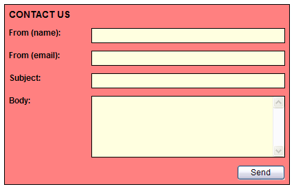
The control you’re going to develop is called the EmailContact control, and will display a small form that allows the user to send an e-mail. A typical use for this is a “Contact Us” page on a Web site where a visitor can send you a message right from your site. Thanks to some fancy features, the control can be reused in many fashions, including a now-famous “feedback” form found at the end of blog postings. (See Figure 2.) You’ll also see how you’re going program the e-mailing functionality directly into the control, demonstrating that custom Web controls can be more than just visual representations, but can contain certain business functionality as well.
You’ll start by creating the EmailContact class and inheriting from WebControl as before; the same rule applies for inheriting from either WebControl or Control. To provide the container-styling for this control you’ll use WebControl.
Render ‘lite’
The Render method in a composite control initially trims down significantly from what you saw in the rendered control. I say initially because in very complex controls, the Render method can contain much more than what you’re going to put in it here. Take a look at this Render method.
In VB.NET:
Protected Overrides Sub Render( _
   ByVal output As HtmlTextWriter)
   Me.EnsureChildControls()
   MyBase.Render(output)
End Sub
In C#:
protected override void Render(
   HtmlTextWriter output)
{
   this.EnsureChildControls();
   base.Render(output);
}
Notice that the second line in the method is just calling the method’s base. The reason you are overriding this method is to insert the call to EnsureChildControls before you call the base rendering method. This method checks to make sure you have set up all the child controls (this is the term I will use for the internal Web controls that reside in the composite control) appropriately before you actually render the control. Before I show you how to set up child controls, let’s determine what child controls are needed and declare them at the top of the class.
Child Controls
The visual elements that are going to be needed for this control consist of a sender’s name, sender’s e-mail, a recipient’s e-mail, an e-mail subject, e-mail body, and of course a send-button. You’re also going to add a heading to the top that may come in handy somewhere. The five fields I’ve just described are going to require a caption and a textbox for each. Now where do you suppose you can get some of those? That’s right-your EmailContact control will contain five instances of the FormField control. It will also contain a Label for the heading and a ConfirmationButton for the send-button. You might as well leverage the button created earlier and gain some of its functionality as well. For this reason, don’t forget to include the assemblies of the previous two controls in your references. You declare child controls at the top of the class like this:
In VB.NET:
Private lblHeading As Label = New Label
Private ctlFromName As FormField = New FormField
Private ctlFromEmail As FormField = New FormField
Private ctlToEmail As FormField = New FormField
Private ctlSubject As FormField = New FormField
Private ctlBody As FormField = New FormField
Private btnSend As ConfirmationButton = _
   New ConfirmationButton
In C#:
private Label lblHeading = new Label();
private FormField ctlFromName = new FormField();
private FormField ctlFromEmail = new FormField();
private FormField ctlToEmail = new FormField();
private FormField ctlSubject = new FormField();
private FormField ctlBody = new FormField();
private ConfirmationButton btnSend =
   new ConfirmationButton();
Now that you’ve established the child controls needed and declared them, you need to massage their properties appropriately and make them visually part of the control. This is done by overriding the CreateChildControls method. This method gets called within the page lifecycle and is where you are expected to build your control tree. Our EmailContact class inherits a property called Controls which is of type ControlsCollection. This property is what contains all the child controls as well as any literal HTML text you want to render as well. Later, when you hit the Render method, the Controls collection will render all its contents in the order they were placed in it. I called this a control tree for a reason. It’s worth mentioning that you can create custom composite controls that contain other custom composite controls, thus creating a control tree. Remember however, that the deeper you get the more performance-heavy your control will get. Let’s take a look at a simple example of the CreateChildControls method using the lblHeading, ctlSubject, and btnSend child controls only, in the interest of space.
Listing 1 shows the code in Visual Basic. Listing 2 shows the same code in C#.
Let’s go through the code in this method because it is the meat of this control and where most of the work will be done. The first part of the code simply sets up the properties of your child controls. Notice that there is a lot of property setting going on here. For example, the CaptionWidth property if the ctlSubject control is set to the CaptionWidth property of your EmailContact control; this is called mapping. Because this custom control contains other controls, the properties of those contained controls are not automatically exposed to the outside, nor do you want them to be. To solve this you’ll add a CaptionWidth property to your control, just like you did to the FormField control before. The property of the child control(s) is then set to the one of its container, which is your composite control. The effect here is that when the programmer uses this on a Web Form and sets the CaptionWidth property in the property browser or in the code-behind class, the child controls that need to will also receive the appropriate setting. This same technique is repeated with other properties.
The second part of the CreateChildControls method builds the Controls collection using the child controls and another control called LiteralControl, which as you can guess is used to place literal text into the Controls collection. This text almost always represents HTML that you want to code around your child controls. You’re once again building HTML, just in a different manner. Notice that some of the building is dependent on the settings of some properties. The point is that when you use the control on a Web Form, turning a property like ShowSubject or ShowSendButton off can toggle the visibility of that portion of the control, making the control much more versatile and reusable. For example, you can choose to display the “To Email” field and allow the user to enter a destination e-mail, thus using this control to send e-mail to anyone. In another case, such as a “Contact Us” page, you can turn the “To Email” field off, yet set a property that the control will also have called ToEmail. This property, which would have to otherwise be set by the “To Email” field, would be used to send the e-mail out without giving the user a choice. In this case, the ToEmail property could be set to your tech-support e-mail address. (See Figure 3 as an example.)
There’s one other thing I want to point out in this code. The Width property of our Label and our FormField control is set to 100%; as is the table cells that contain them, as well as the surrounding table. The point here is that you size your child controls to the full width of the container. Therefore, when you drop the control on a Web Form and resize the control, the contents get resized right along with it. There are of course exceptions depending on what child controls you’re talking about-notice the Send button does not receive the same treatment.
Also notice that I set the ID property of each of the child controls. This is especially important for the purpose of state maintenance. Your child controls know how to maintain state for themselves without any problem, but the ViewState variable uses the ID of each control to save and retrieve its state. Remember in the FormField control you set the ID and Name attributes of the three tags according to the UniqueID of the custom control. By setting the ID of the child controls, you are effectively setting their UniqueID, thus giving each control the information it needs to name its internal tags and thus maintain state properly. This leads me to another addition you must do. Your composite control must implement an interface called INamingContainer. This is an identification interface only and contains no implementation. It is meant to instruct the page parser to appropriately name all child controls upon rendering. You recall that in the FormField control you set the ID and Name attributes to the UniqueID of the control and a hard-coded tag name, delimited by a “_” for ID and “:” for Name. As I stated then, this is the naming convention that you have to follow for rendered controls. Composite controls have the capability to adhere to this naming standard automatically so long as you implement the INamingContainer interface. Without doing this, you run the risk that the user of your custom control will name it on a form using an identical name of a contained child control, which would cause a problem for the page’s state maintenance mechanism.
Composite Control Properties
There are a couple of characteristics of composite control properties that need to be discussed. In the FormField rendered control you used a property coding technique that incorporated the using the ViewState variable to persist the internal value of the properties. In composite controls you have a couple of choices. You can choose to handle the properties the same way. This is fine for properties that define new characteristics of your control, but not really recommended for those that map directly to properties of child controls. The reason is that the child controls are already set up to handle state on their own. If you map their properties to properties in their container (the composite control) which also use ViewState to persist themselves, you run the risk of overbloatting the ViewState. Remember that everything stored in ViewState gets rendered on the page in a hidden textbox called __ViewState. The larger this gets, the more information has to travel through the pipe between the server and the browser. ViewState is one of the more powerful features of ASP.NET and one that automatically takes care of a lot of stuff that you would otherwise have to handle manually, but like every other tool in your arsenal, you need to think ahead and use it wisely. Let’s take a look at how you should code the CaptionWidth property of the EmailContact control, which as I’ve already said, will map to the CaptionWidth properties of some of the child controls.
In VB.NET:
Public Property CaptionWidth() As Unit
   Get
      Me.EnsureChildControls()
      Return Me.ctlFromName.CaptionWidth
   End Get
   Set(ByVal Value As Unit)
      Me.EnsureChildControls()
      ctlFromName.CaptionWidth = Value
      'handle other child controls here too
   End Set
End Property
In C#:
public Unit CaptionWidth
{
   get
   {
      this.EnsureChildControls();
      return this.ctlFromName.CaptionWidth;
   }
   set
   {
      this.EnsureChildControls();
      this.ctlFromName.CaptionWidth = value;
      //handle other child controls here too
   }
}
The area that is commented, ‘handle other child controls…’, would contain the code that sets the other FormField controls’ CaptionWidth properties, as well as that of the lblHeading child control. This technique allows the child controls to maintain their state without the composite control repeating the task. Instead, the composite control simply maps its property to that of the child controls. Notice that the ‘get’ accessor returns the value of one control, while the ‘set’ accessor sets that of several (though only one is shown above). The one coded in the ‘get’ accessor can be any one of the child FormField controls. Since you’re setting all of them, they will all be the same so you can return any one you want. Many properties will map to only one child control, as would be the case for the ButtonWidth property. This property (whose code will not be shown) would map to the Width property of the btnSend child control in the same way shown above. The call to EnsureChildControls is necessary to make sure that the child controls have been initialized before you try to access them. If they have not, then the CreateChildControls method would be automatically called.
For properties that do not map directly to child controls, you would still use the ViewState technique you learned earlier. The ShowSubject property, which I haven’t talked about yet, does not map to any child control; it instead handles a specific behavior to the EmailContact control. This property is coded exactly as the ones you learned about earlier in the design of the FormField control with one addition-The ‘set’ accessor needs to set the ChildControlsCreated property, which is inherited into your composite control, to false.
set
{
   ViewState["ShowSubject"] = value;
   this.ChildControlsCreated = false;
}
Setting this flag ensures an automatic call to the CreateChildControls method so child controls are reset. Don’t worry, that call does not occur upon the setting of this flag, so the flag can be set by the setting of many properties, and only calls to the method will take place upon the next page rendering. You can, in fact, use this style of property handling for all your properties but I would advise you to set the EnableViewState property of the child controls to False since you would no longer rely on their state maintenance ability. There would also be exceptions to turning state off in some child controls, as in the case of contained DropdownList controls that rely on their own state to persist the contents of their list.
By providing plenty of appearance-oriented properties, that is properties that can hide or reposition child controls, you give your composite control maximum flexibility. The downloadable code extensively demonstrates this. Another thing handled in the CreateChildControls is the application of styles. One again this is handled simpler in composite controls than in rendered controls.
Styling
Style properties are defined exactly the same as in the FormField control with the addition of the flag setting described earlier.
this.ChildControlsCreated = false;
The difference with styling in composite controls is how they are applied to the child controls defined within. If you look back at the earlier code defining the CreateChildControls method you’ll notice two methods used, one on the ctlSubject control and a different one on the btnSend control. Here’s a C# recap.
ctlSubject.CaptionStyle.CopyFrom(
   this.CaptionStyle);
ctlSubject.FieldStyle.CopyFrom(
   this.FieldStyle);
ctlSubject.ReadonlyFieldStyle.CopyFrom(
   this.ReadonlyFieldStyle);

btnSend.ApplyStyle(this.ButtonStyle);
When you designed the FormField control, which is the type of the ctlSubject child control, you gave it several styling properties. The first thing you have to do with your EmailContact control in regards to styling is to define its styling properties as well, which as you can probably guess will somehow be mapped to the child controls. First of all, for simplicity, you would define the style properties exactly as you did in the FormField control, but once again with the addition of the ChildControlsCreated setting. The way you would then “map” the style properties is with the CopyFrom method of the Style object. That’s all there is to it for those controls. The ApplyStyle method used in the case of the btnSend and lblHeading child control, applies the style property to the main style of the child control as opposed to a style property. The main style constitutes the styling properties inherited from the WebControl class. Remember these properties will apply styling to the control’s container where added style properties add styling to elements within the control. This is the case in both the FormField and EmailContact controls. Remember, the btnSend control is of type ConfirmationButton, which you’ll recall inherits from the Button class. You did not add any custom styling to this control, and the Button class does not expose any style properties. All the properties the Style object exposes are exposed by the WebControl class, which is the base of the Button class. As I said, ApplyStyle corresponds to these properties. The FormField control has these properties as well and is certainly compatible with ApplyStyle. Though you have not done so in your EmailContact, you can certainly add a styling property corresponding to the surrounding container of each contained FormField control. This property can then be applied to the child controls. However, you are mapping styling properties to the custom styling properties you gave the FormField control and that is done with the CopyFrom method.
The styling that the final version of the EmailContact control provides allows the control to be integrated into any Web site. Figures 6 and 7 show pictures of the same control in two different sites.
There’s one child control left for which you need to provide some special handling; this is the btnSend control. The intent of your control is to be able to send e-mails for you when a user clicks this button so you need to handle an event here.
Event Handling
Events are one area where composite controls shine in terms of simplicity and ease to follow. Implementation of the IPostBackEventHandler and IPostBackDataHandler interfaces is not necessary. This is not to say that they cannot be used in special circumstances, but such are beyond the scope of this article and are usually the case in very complex Web controls. You’ve noticed so far that the design of a composite control is very straightforward and very similar to how you would render controls dynamically on a Web Form using its code-behind class. Events are no exception. You need to wire an event handler from the btnSend control’s Click event to a method within your EmailContact control, much like you would wire such an event from a control to a Web Form’s method. You’re going to do this wiring in the constructor of the control. Since you’re initializing your child controls at the class level, you don’t want to wire events in the CreateChildControls method, otherwise multiple event handlers can end up wired every time the method gets called. Some control developers choose to simply declare their child controls at the class level and then initialize them in the CreateChildControls method. In this case, the event handlers can be wired in that method since the controls are getting reinitialized on every hit, and the event handlers are getting cleared. I’ve seen it both ways and choose to do it the way I am demonstrating here because I am trying to limit the actual object instantiations, which is where the performance hit of composite controls resides.
In VB.NET:
Public Sub New()
   SetDefaults()
   AddHandler btnSend.Click, _
      AddressOf btnSend_Click
End Sub
In C#:
public EmailContact()
{
   SetDefaults();
   btnSend.Click +=
      new EventHandler(btnSend_Click);
}
This code should not be strange to you, as it simply wires the Click event of the btnSend control to the btnSend_Click method. Incidentally, the SetDefaults method you see here simply initializes some of the child control properties. The btnSend_Click event is a place where you can give your control a lot of versatility. I’ll show you an abridged version of it and then I’ll describe what’s going on.
In VB.NET:
Protected Sub btnSend_Click( _
   ByVal sender As Object, ByVal e As EventArgs)
   If Me.AutoHandle) Then
      Dim o_EventArgs As CancelEventArgs = _
         New CancelEventArgs
      RaiseEvent BeforeEmailSend(Me, _
         o_EventArgs)
      If Not o_EventArgs.Cancel Then
         ' Send email here
         RaiseEvent AfterEmailSend(_
            Me, New EventArgs)
      End If
   Else
      RaiseEvent SendButtonClick( _
         Me, New EventArgs)
   End If
End Sub
In C#:
protected void btnSend_Click(
   object sender, EventArgs e)
{
   if(this.AutoHandle)
   {
      CancelEventArgs o_EventArgs =
         new CancelEventArgs();
      if (this.BeforeEmailSend != null)
         this.BeforeEmailSend(this,
            o_EventArgs);
      if(!o_EventArgs.Cancel)
      {
         // Send email here
         if (this.AfterEmailSend != null)
            this.AfterEmailSend(this,
               new EventArgs());
      }
   }
   else
   {
      if (this.SendButtonClick != null)
         this.SendButtonClick (this,
            new EventArgs());
   }
}
The btnSend_Click method gets called within the EmailContact control when the Send button is clicked. Remember that the btnSend control raises its event to its container; in this case that is your EmailContact control, not a Web Form. It is in this method that you are going to handle e-mail-sending functionality, but you’re going to do it in a way that will make this control usable in many other situations. As you see in the code, I’m checking a property called AutoHandle to determine if you’re going to handle sending an e-mail or simply raise an event (SendButtonClick). You may run into the situation where a developer wants to use this control strictly for visual purposes. If you go through all the properties of the finished control in the downloadable code, you’ll see that I expose the value of every text field in the control whether or not you chose to show it (remember the ShowSubject property). A Web site may want to handle special e-mailing circumstances within their Web Forms and simply use your control for the data entry portion; afterward raising an event informing the form that it’s free to perform whatever tasks it sees fit. By simply toggling a property, AutoHandle, you can provide the choice of automatically handling e-mailing or manually handling it. To provide even further functionality, I have added two more events to raise in the case the developer has chosen to have your control handle e-mailing automatically, BeforeEmailSend and AfterEmailSend. Obviously these events allow the control to inform the Web Form when it’s about to send an e-mail and when it’s done. The BeforeEmailSend event is defined using the CancelEventHandler delegate so that the Web Form that receives the event can set the Cancel property in the arguments to true. As you can see, this is then checked in the code to determine whether to continue with the e-mail sending functionality.
I’ve left out the details of the e-mail sending code as well as error handling code in the interest of space, but the downloadable code contains everything. The final code also defines the AfterEmailSend event with an event handler delegate that returns a success/failure indicator. I also want to note that the control includes properties you can use to set the mail server, destination e-mail, or other field values to assist the control in its communication functionality.
Although I’ve left out a lot of extra functionality of this control that is in the downloadable code, you’re pretty much done with the EmailContact composite Web control. The three controls I’ve discussed in this article demonstrate the three types of ASP.NET Web controls and demonstrate many of the technologies involved in creating them; many but not all. There are other technologies in the .NET Framework that you can use when designing and developing custom Web controls and though explaining them in full is beyond this article, I will briefly summarize them for you.
Other Associated Technologies
Designers
By not applying a designer class to your controls you inherently use the default designer. A designer controls the way the control renders in Visual Studio during design of a Web Form. Some controls, such as custom grids for example, may need to display themselves in a certain way during design time and a different way at run time (to display sample data perhaps). A custom designer comes into play here.
Complex Properties
These are properties that are object types which contain other properties. They display in the property browser as an expandable line and serve the purpose of grouping properties together and can be reused in many controls. The Style object is an example of a complex property.
Type Converters
These are classes that can be applied to properties using attributes. They change the way a property displays itself in the property browser. Think of displaying Yes or No choices for a Boolean instead of True or False.
Templates
Templates are incredibly powerful and allow you as the control developer to set aside areas within your control whose content will be defined later by the developer using the control. In a DataGrid, for example, you can define a column as a templated-column. As the developer using the DataGrid control, you can either drag out or programmatically add other controls inside this column.
Event Bubbling
Typically used in conjunction with Templates, event bubbling allows the handling of events fired from controls that another developer inserts into templates defined in your controls.
Client-side Scripting
In the ConfirmationButton control I demonstrated some simple client-side scripting by adding JavaScript code to the button’s onclick event. This just touched the surface on what you can do with client-side scripting. In fact, custom Web controls are a great way to expose client-side scripting functionality to Web Forms.
Custom Style Objects
You can define your classes that inherit from the Style object and add further properties or functionality. An example of this is the TableStyle object which adds a couple more properties that apply to Tables; including CellSpacing and Cellpadding.
Data Binding
This can be a broad topic depending on exactly what kind of data binding you have in mind. The infrastructure that the Control class provides for you supports the basics of data binding; that is, the properties, methods, and events involved. How you use them is up to you, the control developer. Depending on their intent, custom Web controls can provide general all-purpose data binding such as that which is compatible with any object that supports the IEnumerable interface, or they can have very business-specific data binding.
Control Builders
Custom control builders allow you to redefine how a control renders on an ASPX page, in regards to white space, and nested tags within the main one.
Validation
There are different types of validation in the context of Web controls. Client-side validation enables your custom controls to be compatible with the ASP.NET validation controls that .NET provides. Server-side validation is provided by implementing the IValidator interface and works in conjunction with the IsValid check performed on the Page object. The last type of validation is the act of actually developing a validation control, such as the validators that Microsoft already provides. This is accomplished by deriving a control from the BaseClassValidator base class.
Custom Verbs
These are the little links you might have seen at the bottom of the property browser for a given control. Drop a DataGrid on a Web Form and look at its properties in the property browser. You’ll see a couple of links at the bottom. These usually provide some sort of wizards to assist you in the configuration of the control. Special formatting functionality is also commonly seen in this fashion.
Other Attributes
I’ve demonstrated a couple of different attributes you can apply to control classes or properties, but there are many others I did not have the room to talk about here. Some are used to apply the technologies I’m covering in this list.
Cross-Platform Compatibility
Web controls have the ability to contain their own platform checks-this includes browser checks and mobile platform checks. You can then choose different rendering methods depending on what platform is using them. ASP.NET 2.0 will expose a much more robust framework for determining client information and building more robust controls that will work with not only different browsers, but with any client.
ASP.NET 2.0
The next release of ASP.NET adds a few extra gifts to the world of Web controls. For starters, there are claims that the ViewState has been decrease in size by as much as 47% in some cases. This in itself is a great achievement since ViewState growth is always something to keep an eye on when designing Web pages. Also, there is a new StateBag called ControlState. You access it using its own set of three methods (as in ViewState) only. As a control developer, you decide what properties are important enough to store here. This eliminates the all-or-nothing method of controlling state you have today.
ASP.NET 2.0 also includes many new Web controls out of the box, including a new grid called GridView. In my last article I described a few of these in detail so I won’t repeat it here. Some of these new controls support a new feature called script callbacks. This allows for a control to obtain information form the server without a “complete page postback.” The details are beyond this article, but this method of calling the server-side code does not refresh the entire page, thus eliminating the page-flicker caused by a postback. The technology behind script-callbacks is based on XMLHTTP and is similar to what today is known as Ajax.
ASP.NET 2.0’s new controls including the DetailsView, FormView, and an assortment of authentication-based controls are a perfect example of how you can use Web controls for more than simple visual objects, but rather for larger more complex solutions including complete forms. ASP.NET 2.0’s new data source controls demonstrate how a Web control may not even have a user interface, but instead can be used to service other controls. Programming Web Forms in this manner is known as Declarative Programming.
Declarative Programming
Custom Web controls do not only have to serve their cause as reusable components, they can be used as an approach to ASP.NET development. This can serve many purposes including better encapsulation, further breakdown of visual components, and full object-orientation for the UI. Of course reusability is always a welcome side-effect. Moving site objects and functionality to Web controls is a style called Declarative Programming. I urge you to refer to the March/April 2005 issue of CoDe Magazine for a full explanation of this approach to ASP.NET development.
Conclusion
True object-oriented programming has been given to us with the release of .NET, and Web controls have allowed us to bring it to the UI level, giving us a level of encapsulation and reusability that exceeds anything we have used in the past. Many of you are already familiar with them and are already developing your own, but it amazed me to speak to many other ASP.NET developers after over three years since the release of .NET, and discover that they never went beyond dragging pre-packaged Web controls onto Web Forms. I understand that the .NET Framework is massive and I’m still learning new things every single day, and I hope that reading this article gets you interested in learning more about these elements of reusability that have once again revolutionized the way Web applications are designed and developed.